Neumorphic Button in iOS 16 and SwiftUI

SwiftUI 4 introduced ShadowStyle which is used to style shadows. It provides two static functions for custom shadow styles.
.drop(color:radius:x:y) creates a custom drop shadow style. Drop shadow draw behind the source content by blurring, tinting and offsetting its per-pixel alpha values.
.inner(color:radius:x:y) creates a custom inner shadow style. Inner shadows draw on top of the source content by blurring, tinting, inverting and offsetting its per-pixel alpha values.
In this article, we will use these two ShadowStyles to create a Neumorphic button.
Let’s start by defining the view.
struct DevTechieNeumorphicButtonExample: View { }We will add two color properties, one for off white color and another for shadow color.
let offWhiteColor = Color(red: 236/255, green: 234/255, blue: 235/255)let shadowColor = Color(red: 197/255, green: 197/255, blue: 197/255)For view’s body, we will ZStack which will host off white color to act as a background for our view. We also want to ignore safe area so Color view can expand to cover the entire screen.
struct DevTechieNeumorphicButtonExample: View {
    let offWhiteColor = Color(red: 236/255, green: 234/255, blue: 235/255)
    let shadowColor = Color(red: 197/255, green: 197/255, blue: 197/255)
    var body: some View {
        ZStack {
            offWhiteColor
                .ignoresSafeArea()

        }
    }
}
Our view will look something like this:
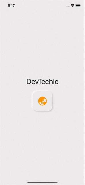
We will add a VStack for our content and add a button, this button will have a background with fill as two shadowStyles. One drop shadow will be offset to (3,3) point and another one will be (-3,-3). This will create the raised button effect.
struct DevTechieNeumorphicButtonExample: View {
    let offWhiteColor = Color(red: 236/255, green: 234/255, blue: 235/255)
    let shadowColor = Color(red: 197/255, green: 197/255, blue: 197/255)
    var body: some View {
        ZStack {
            offWhiteColor
                .ignoresSafeArea()

            VStack {
                Text("DevTechie")
                    .font(.largeTitle)

                Button(action: {}){
                    Image(systemName: "globe.asia.australia.fill")
                        .resizable()
                        .frame(width: 40, height: 40)
                        .padding(25)
                        .foregroundColor(Color.orange)
                        .background(
                            RoundedRectangle(cornerRadius: 20, style: .continuous)
                                .fill(
                                    .shadow(.drop(color: shadowColor,radius: 3, x:3, y: 3))
                                    .shadow(.drop(color: .white, radius: 3, x: -3, y: -3))
                                )
                                .foregroundColor(offWhiteColor))
                }
            }
        }
    }
}
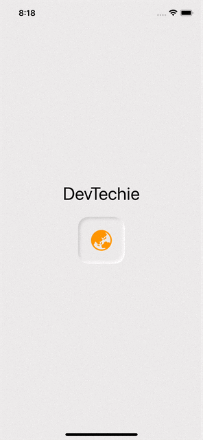
We can easily change this from drop to inner ShadowStyle to change the button style.
struct DevTechieNeumorphicButtonExample: View {
    let offWhiteColor = Color(red: 236/255, green: 234/255, blue: 235/255)
    let shadowColor = Color(red: 197/255, green: 197/255, blue: 197/255)
    var body: some View {
        ZStack {
            offWhiteColor
                .ignoresSafeArea()

            VStack {
                Text("DevTechie")
                    .font(.largeTitle)

                Button(action: {}){
                    Image(systemName: "globe.asia.australia.fill")
                        .resizable()
                        .frame(width: 40, height: 40)
                        .padding(25)
                        .foregroundColor(Color.orange)
                        .background(
                            RoundedRectangle(cornerRadius: 20, style: .continuous)
                                .fill(
                                    .shadow(.inner(color: shadowColor,radius: 3, x:3, y: 3))
                                    .shadow(.inner(color: .white, radius: 3, x: -3, y: -3))
                                )
                                .foregroundColor(offWhiteColor))
                }
            }
        }
    }
}
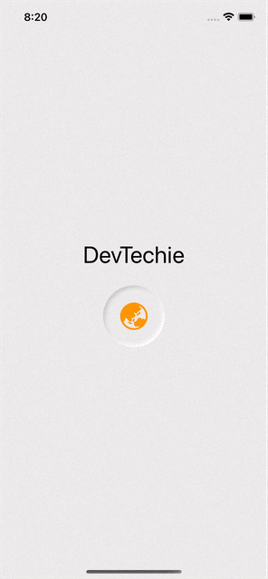
We can change button to be circle by changing background from RoundedRectangle to Circle.
.background(
    Circle()
        .fill(
            .shadow(.inner(color: shadowColor,radius: 3, x:3, y: 3))
            .shadow(.inner(color: .white, radius: 3, x: -3, y: -3))
        )
        .foregroundColor(offWhiteColor)
)