Button Style Animation in SwiftUI
Photo by Angèle Kamp on Unsplash
The ButtonStyle protocol is used to customize a button’s appearance. To configure the button style for a view, we create a struct, conforming ButtonStyle protocol, and then we use the buttonStyle(_:) modifier to apply the newly created style.
The ButtonStyle protocol requires the makeBody(configuration: Configuration) function to be implemented where we get the opportunity to customize our button.
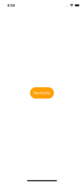
Let’s take an example for this, we will create a new struct called “CustomButtonStyle” which will conform to the ButtonStyle protocol. We will provide a definition for the makeBody function for customization. Our button will change background when pressed and will scale in size when the button is in a pressed state. Configuration parameter gives us access to button’s label along with button’s role and isPressed state. We will employ, isPressed state to animate these changes as shown below::
struct CustomButtonStyle: ButtonStyle {
    func makeBody(configuration: Configuration) -> some View {
        configuration.label
            .padding()
            .background(configuration.isPressed ? .pink : .orange)
            .foregroundColor(.white)
            .clipShape(Capsule())
            .scaleEffect(configuration.isPressed ? 1.5 : 1)
            .animation(.easeOut(duration: 0.2), value: configuration.isPressed)
    }
}
Let’s apply this style to a button view:
struct FrameAnimation: View {
    var body: some View {
        Button("DevTechie") {
            print("Button pressed!")
        }
        .buttonStyle(CustomButtonStyle())
    }
}
With that we have reached the end of this article. Thank you once again for reading. Subscribe to our weekly newsletter at https://www.devtechie.com