LazyVGrid in SwiftUI
DevTechie Inc
DevTechie Inc

LazyVGrid layout views in vertical directions just like VStack or LazyVStack with the ability to arrange child views in a grid layout. As the name suggests the vertical grid is lazy in nature, meaning grid cells will be rendered as they appear on the screen.
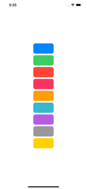
Let’s start with a single column grid example. LazyVGrid asks about column information in columns init parameter. This parameter takes array of GridItem type.
struct LazyVGridExample: View {
    let colors = [Color.blue, .green, .red, .pink, .orange, .teal, .purple, .gray, .yellow]
    let columns = [GridItem()]
    var body: some View {
        LazyVGrid(columns: columns) {
            ForEach(colors, id: \.self) { color in
                RoundedRectangle(cornerRadius: 10)
                    .fill(color)
                    .frame(width: 100, height: 50)
            }
        }
    }
}
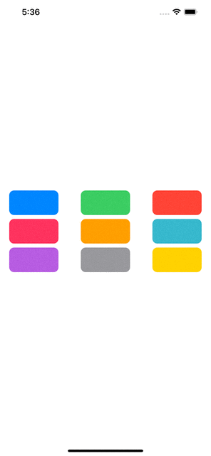
Adding more columns
Adding additional columns is as easy as adding more GridItems into the columns array.
struct LazyVGridExample: View {
    let colors = [Color.blue, .green, .red, .pink, .orange, .teal, .purple, .gray, .yellow]
    let columns = [GridItem(), GridItem(), GridItem()]
    var body: some View {
        LazyVGrid(columns: columns) {
            ForEach(colors, id: \.self) { color in
                RoundedRectangle(cornerRadius: 10)
                    .fill(color)
                    .frame(width: 100, height: 50)
            }
        }
    }
}
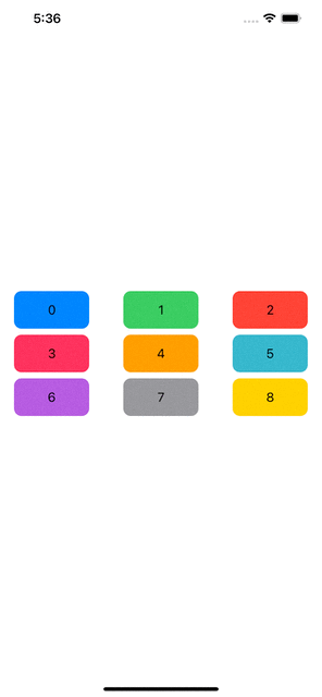
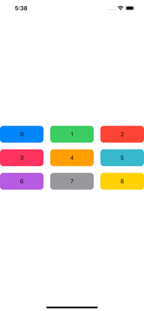
Adding numbers to these cells will help us understand how the cells are added.
struct LazyVGridExample: View {
    let colors = [Color.blue, .green, .red, .pink, .orange, .teal, .purple, .gray, .yellow]
    let columns = [GridItem(), GridItem(), GridItem()]
    var body: some View {
        LazyVGrid(columns: columns) {
            ForEach(colors.indices, id: \.self) { idx in
                RoundedRectangle(cornerRadius: 10)
                    .fill(colors[idx])
                    .frame(width: 100, height: 50)
                    .overlay(Text("\(idx)"))
            }
        }
    }
}
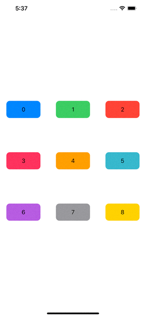
Spacing in Grid Cells
Just like HStack or VStack, LazyVGrid also provides a way to add spacing between grid cells. LazyVGrid spacing is applied on the rows. For example:
struct LazyVGridExample: View {
    let colors = [Color.blue, .green, .red, .pink, .orange, .teal, .purple, .gray, .yellow]
    let columns = [GridItem(), GridItem(), GridItem()]
    var body: some View {
        LazyVGrid(columns: columns, spacing: 100) {
            ForEach(colors.indices, id: \.self) { idx in
                RoundedRectangle(cornerRadius: 10)
                    .fill(colors[idx])
                    .frame(width: 100, height: 50)
                    .overlay(Text("\(idx)"))
            }
        }
    }
}
We can also apply column spacing by defining spacing in GridItem:
struct LazyVGridExample: View {
    let colors = [Color.blue, .green, .red, .pink, .orange, .teal, .purple, .gray, .yellow]
    let columns = [GridItem(spacing: 20), GridItem(spacing: 20), GridItem(spacing: 20)]
    var body: some View {
        LazyVGrid(columns: columns, spacing: 20) {
            ForEach(colors.indices, id: \.self) { idx in
                RoundedRectangle(cornerRadius: 10)
                    .fill(colors[idx])
                    .frame(height: 50)
                    .overlay(Text("\(idx)"))
            }
        }
    }
}
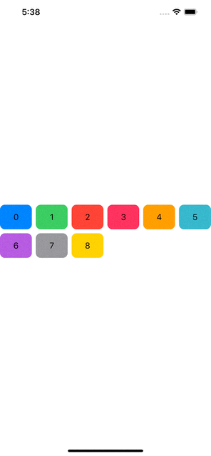
Flexible GridItem
GridItem initialized without any parameter creates an item which is of type flexible. Flexible grid item meaning the cell will grow or shrink its size depending upon the space available and number of columns in the grid. As shown below. We will remove width from RoundedRectangle and add bunch of GridItems in the columns array.
struct LazyVGridExample: View {
    let colors = [Color.blue, .green, .red, .pink, .orange, .teal, .purple, .gray, .yellow]
    let columns = [GridItem(), GridItem(), GridItem(), GridItem(), GridItem(), GridItem()]
    var body: some View {
        LazyVGrid(columns: columns) {
            ForEach(colors.indices, id: \.self) { idx in
                RoundedRectangle(cornerRadius: 10)
                    .fill(colors[idx])
                    .frame(height: 50)
                    .overlay(Text("\(idx)"))
            }
        }
    }
}
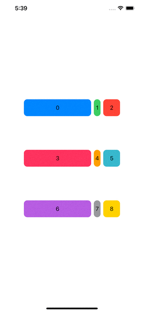
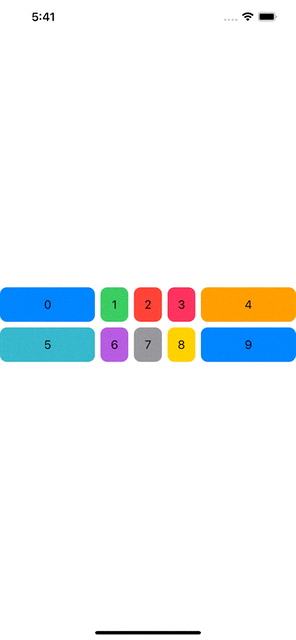
Flexible GridItem also takes minimum and maximum values to fix the size of column cell. We will try all three variations in the example below:
struct LazyVGridExample: View {
    let colors = [Color.blue, .green, .red, .pink, .orange, .teal, .purple, .gray, .yellow]
    let columns = [GridItem(.flexible(minimum: 200)), GridItem(.flexible(maximum: 20)), GridItem(.flexible(minimum: 10, maximum: 50))]
    var body: some View {
        LazyVGrid(columns: columns, spacing: 100) {
            ForEach(colors.indices, id: \.self) { idx in
                RoundedRectangle(cornerRadius: 10)
                    .fill(colors[idx])
                    .frame(height: 50)
                    .overlay(Text("\(idx)"))
            }
        }
    }
}
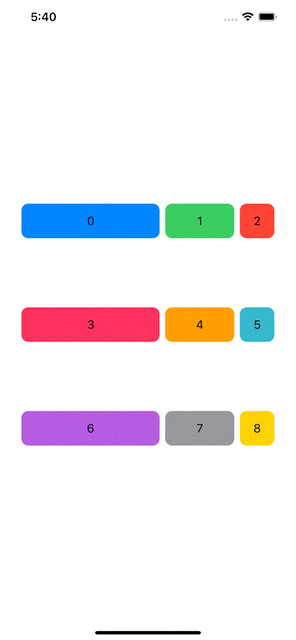
Fixed Size Cell
Just like flexible, we also have option to specify fixed size for the cell with the help of fixed type of GridItem. Let’s update our example to include mix of fixed and flexible GridItem.
struct LazyVGridExample: View {
    let colors = [Color.blue, .green, .red, .pink, .orange, .teal, .purple, .gray, .yellow]
    let columns = [GridItem(.fixed(200)), GridItem(.fixed(100)), GridItem(.flexible(minimum: 10, maximum: 50))]
    var body: some View {
        LazyVGrid(columns: columns, spacing: 100) {
            ForEach(colors.indices, id: \.self) { idx in
                RoundedRectangle(cornerRadius: 10)
                    .fill(colors[idx])
                    .frame(height: 50)
                    .overlay(Text("\(idx)"))
            }
        }
    }
}
Adaptive Cell
If you want a grid that can have as many columns as it can fit in as long as they follow your min and max size specifications then adaptive GridItem type will work best. Adaptive GridItems take minimum value and maximum value so it can make room for other cells in the available space, as shown in the example below:
struct LazyVGridExample: View {
    let colors = [Color.blue, .green, .red, .pink, .orange, .teal, .purple, .gray, .yellow, .blue]
    let columns = [GridItem(.adaptive(minimum: 100)), GridItem(.adaptive(minimum: 30, maximum: 100)), GridItem(.adaptive(minimum: 200))]
    var body: some View {
        LazyVGrid(columns: columns) {
            ForEach(colors.indices, id: \.self) { idx in
                RoundedRectangle(cornerRadius: 10)
                    .fill(colors[idx])
                    .frame(height: 50)
                    .overlay(Text("\(idx)"))
            }
        }
    }
}
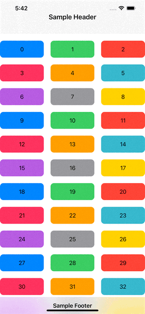
PinnedViews in LazyVGrid
LazyVGrid supports pinnedViews, which can allow us to pin header and footer views for the Grid.
We will create two very simple views for our header and footer:
struct LazyVGridHeaderView: View {
    var body: some View {
        Text("Sample Header")
            .font(.title3.bold())
            .frame(height: 100)
            .frame(maxWidth: .infinity)
            .background(.thinMaterial)

    }
}struct LazyVGridFooterView: View {
    var body: some View {
        Text("Sample Footer")
            .font(.body.bold())
            .frame(height: 50)
            .frame(maxWidth: .infinity)
            .background(.thinMaterial)

    }
}
I will also copy paste color values to increase the number of cells grid so we have something to scroll, wrap our LazyVGrid into a ScrollView and add pinnedView parameter to the view as shown below:
struct LazyVGridExample: View {
    let colors = [Color.blue, .green, .red, .pink, .orange, .teal, .purple, .gray, .yellow, Color.blue, .green, .red, .pink, .orange, .teal, .purple, .gray, .yellow, Color.blue, .green, .red, .pink, .orange, .teal, .purple, .gray, .yellow, Color.blue, .green, .red, .pink, .orange, .teal, .purple, .gray, .yellow, Color.blue, .green, .red, .pink, .orange, .teal, .purple, .gray, .yellow, Color.blue, .green, .red, .pink, .orange, .teal, .purple, .gray, .yellow]
    let columns = [GridItem(spacing: 20), GridItem(spacing: 20), GridItem(spacing: 20)]
    var body: some View {
        ScrollView {
            LazyVGrid(columns: columns, spacing: 20, pinnedViews: [.sectionHeaders, .sectionFooters]) {
                Section(header: LazyVGridHeaderView(), footer: LazyVGridFooterView()) {
                    ForEach(colors.indices, id: \.self) { idx in
                        RoundedRectangle(cornerRadius: 10)
                            .fill(colors[idx])
                            .frame(height: 50)
                            .overlay(Text("\(idx)"))
                    }
                }
            }

        }

    }
}
With that we have reached the end of this article. Thank you once again for reading. Don’t forget to subscribe our weekly newsletter at