SwiftUI TextField: a closer look

TextField is a control that displays an editable text interface. TextField creates an input field that users can interact with. TextField provides the ability to read and write text for apps. UITextField is its counterpart in UIKit.
TextField uses bindable values to get and set text which enables us to work directly with data. Change in data is observed by binding variables and TextField can react to those changes.
Let’s start with a simple TextField example. Simplest form of TextField can be created with a label and a binding value.
Note: If the binding value is of type String then TextField updates the value as user types in the field; otherwise updates to the value happen when the user commits the change by pressing return key.
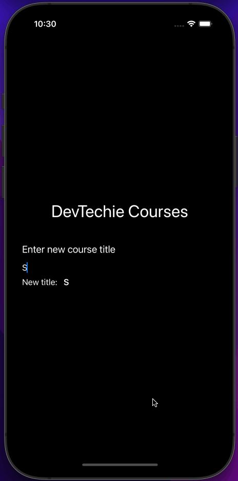
For this example, we will create a view to add a new DevTechie course. View will have a TextField which will allow users to enter the course’s title. We will create a @State variable named “title” and use it as binding property for TextField.
Reading TextField value is as easy as writing it. We will create a Text view and use it to display title value being typed by the user in TextField.
struct TextFieldExample: View {

    @State private var title: String = ""

    var body: some View {
        VStack {
            Text("DevTechie Courses")
                .font(.largeTitle)

            VStack(alignment: .leading) {
                Text("Enter new course title")
                    .font(.title3)

                TextField("Enter title here", text: $title)

                HStack {
                    Text("New title: ")
                    Text(title)
                        .bold()
                }
            }.padding(.top, 20)
        }.padding()
    }
}
TextField Style
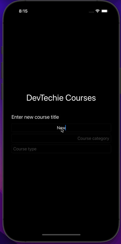
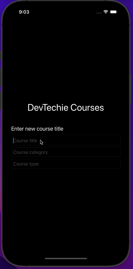
By default, TextField doesn’t have any border or style around it so if you don’t have prompt it almost blend itself into the background of the app as you can see below:

We can’t tell if there is any TextField there on screen until user taps on the field. We need to style our TextField better so it can be visible.
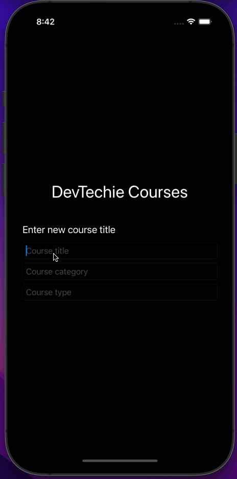
There is a modifier to make TextField standout and it’s called TextFieldStyle.
TextFieldStyle has three predefined values: automatic, plain, and roundedBorder.
automatic and plain render TextField without any border whereas roundedBorder style renders a border around TextField. Example below shows the visual difference between them:

Text Alignment in TextField
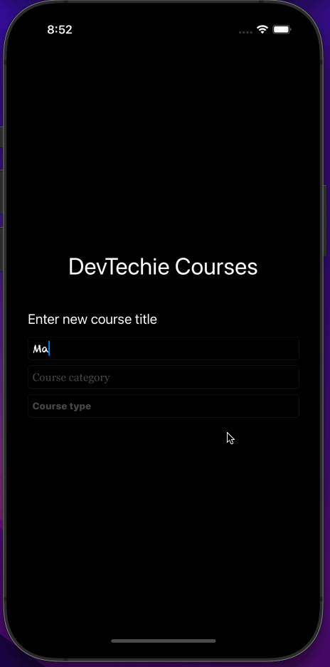
TextField supports alignment for the typed text with the use of multilineTextAlignment modifier.
MultilineTextAlignment has three alignment values leading, center, trailing. Let’s see them in use with an example. We will add two more State properties to track course category and course type for the new DevTechie course.
struct TextFieldExample: View {

    @State private var title: String = ""
    @State private var category: String = ""
    @State private var type: String = ""

    var body: some View {
        VStack {
            Text("DevTechie Courses")
                .font(.largeTitle)

            VStack(alignment: .leading) {
                Text("Enter new course title")
                    .font(.title3)

                TextField("Course title", text: $title)
                    .textFieldStyle(.roundedBorder)
                    .multilineTextAlignment(.center)

                TextField("Course category", text: $category)
                    .textFieldStyle(.roundedBorder)
                    .multilineTextAlignment(.trailing)

                TextField("Course type", text: $type)
                    .textFieldStyle(.roundedBorder)
                    .multilineTextAlignment(.leading)

            }.padding(.top, 20)
        }.padding()
    }
}
Text Auto Capitalization in TextField
SwiftUI provides an inbuilt modifier called textInputAutocapitalization to control text Autocapitalization within TextField. Modifier has four values to choose from:
Characters: defines an autocapitalization behavior that will capitalize every letter.
Never: defines an autocapitalization behavior that will not capitalize anything.
Sentences: defines an autocapitalization behavior that will capitalize first letter in every sentence
Words: defines an autocapitalization behavior that will capitalize the first letter of every word.
In our example, we will use words for course title, characters for course category and never for course type.
struct TextFieldExample: View {

    @State private var title: String = ""
    @State private var category: String = ""
    @State private var type: String = ""

    var body: some View {
        VStack {
            Text("DevTechie Courses")
                .font(.largeTitle)

            VStack(alignment: .leading) {
                Text("Enter new course title")
                    .font(.title3)

                TextField("Course title", text: $title)
                    .textFieldStyle(.roundedBorder)
                    .textInputAutocapitalization(.words)


                TextField("Course category", text: $category)
                    .textFieldStyle(.roundedBorder)
                    .textInputAutocapitalization(.characters)


                TextField("Course type", text: $type)
                    .textFieldStyle(.roundedBorder)
                    .textInputAutocapitalization(.never)


            }.padding(.top, 20)
        }.padding()
    }
}
Font modifier in TextField
TextField works well with the font modifier. Use the font modifier to change TextField’s font family, size, weight etc. Applied font changes also affect placeholder text in TextField.
For our example, we will use two pre-installed custom fonts in iOS called Chalkduster and Georgia.
struct TextFieldExample: View {

    @State private var title: String = ""
    @State private var category: String = ""
    @State private var type: String = ""

    var body: some View {
        VStack {
            Text("DevTechie Courses")
                .font(.largeTitle)

            VStack(alignment: .leading) {
                Text("Enter new course title")
                    .font(.title3)

                TextField("Course title", text: $title)
                    .textFieldStyle(.roundedBorder)
                    .font(.custom("Chalkduster", size: 16))


                TextField("Course category", text: $category)
                    .textFieldStyle(.roundedBorder)
                    .font(.custom("Georgia", size: 16))


                TextField("Course type", text: $type)
                    .textFieldStyle(.roundedBorder)
                    .font(.system(size: 14, weight: .heavy, design: .rounded))


            }.padding(.top, 20)
        }.padding()
    }
}
Autocorrection in TextField
TextField by default auto corrects values entered by users according to their locale but if you need to disable this feature then use disableAutocorrection modifier for that purpose. TextFields where you are expecting user’s to enter their first name, last name or username can be some examples where you may want to disable auto correct feature.
struct TextFieldExample: View {

    @State private var title: String = ""
    @State private var category: String = ""
    @State private var type: String = ""

    var body: some View {
        VStack {
            Text("DevTechie Courses")
                .font(.largeTitle)

            VStack(alignment: .leading) {
                Text("Enter new course title")
                    .font(.title3)

                TextField("Course title", text: $title)
                    .textFieldStyle(.roundedBorder)
                    .disableAutocorrection(true)

                TextField("Course category", text: $category)
                    .textFieldStyle(.roundedBorder)

                TextField("Course type", text: $type)
                    .textFieldStyle(.roundedBorder)
                    .disableAutocorrection(true)

            }.padding(.top, 20)
        }.padding()
    }
}
Border around TextField
TextField rounded border style is one of the styles available to format your control but if you don’t want to use rounded border then you can use border modifier to create a custom border around your TextField.
struct TextFieldExample: View {

    @State private var title: String = ""
    @State private var category: String = ""
    @State private var type: String = ""

    var body: some View {
        VStack {
            Text("DevTechie Courses")
                .font(.largeTitle)

            VStack(alignment: .leading) {
                Text("Enter new course title")
                    .font(.title3)

                TextField("Course title", text: $title)
                    .padding(5)
                    .border(Color.orange, width: 2)

                TextField("Course category", text: $category)
                    .padding(5)
                    .border(Color.teal, width: 2)

                TextField("Course type", text: $type)
                    .padding(5)
                    .border(Color.pink, width: 2)

            }.padding(.top, 20)
        }.padding()
    }
}
Notice we used padding right before the border modifier, that’s to provide some breathing room between TextField and border

BackgroundColor for TextField
TextField view doesn’t provide a way to add background color but we can use the background modifier to add color to the TextField.
struct TextFieldExample: View {

    @State private var title: String = ""
    @State private var category: String = ""
    @State private var type: String = ""

    var body: some View {
        VStack {
            Text("DevTechie Courses")
                .font(.largeTitle)

            VStack(alignment: .leading) {
                Text("Enter new course title")
                    .font(.title3)

                TextField("Course title", text: $title)
                    .padding(5)
                    .background(Color.orange)

                TextField("Course category", text: $category)
                    .padding(5)
                    .background(Color.teal)

                TextField("Course type", text: $type)
                    .padding(5)
                    .background(Color.pink.opacity(0.2))

            }.padding(.top, 20)
        }.padding()
    }
}
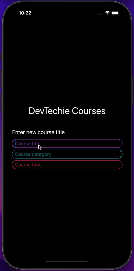
Custom Border for TextField
We have already seen adding a border to TextField but if we need a rounded corner border for example, for TextField then we will have to use the overlay modifier instead which gives us an opportunity to add shapes as the border for TextField.
struct TextFieldExample: View {

    @State private var title: String = ""
    @State private var category: String = ""
    @State private var type: String = ""

    var body: some View {
        VStack {
            Text("DevTechie Courses")
                .font(.largeTitle)

            VStack(alignment: .leading) {
                Text("Enter new course title")
                    .font(.title3)

                TextField("Course title", text: $title)
                    .padding(5)
                    .overlay(
                        RoundedRectangle(cornerRadius: 20)
                            .stroke(Color.orange)
                    )

                TextField("Course category", text: $category)
                    .padding(5)
                    .overlay(
                        RoundedRectangle(cornerRadius: 20)
                            .stroke(Color.teal)
                    )

                TextField("Course type", text: $type)
                    .padding(5)
                    .overlay(
                        RoundedRectangle(cornerRadius: 20)
                            .stroke(Color.pink)
                    )

            }.padding(.top, 20)
        }.padding()
    }
}
ForegroundColor with TextField
Text inside TextField can be customized for different colors as well. We can use the ForegroundColor modifier to change the color of text as well as the placeholder text.
struct TextFieldExample: View {

    @State private var title: String = ""
    @State private var category: String = ""
    @State private var type: String = ""

    var body: some View {
        VStack {
            Text("DevTechie Courses")
                .font(.largeTitle)

            VStack(alignment: .leading) {
                Text("Enter new course title")
                    .font(.title3)

                TextField("Course title", text: $title)
                    .padding(5)
                    .overlay(
                        RoundedRectangle(cornerRadius: 20)
                            .stroke(Color.orange)
                    )
                    .foregroundColor(Color.green)

                TextField("Course category", text: $category)
                    .padding(5)
                    .overlay(
                        RoundedRectangle(cornerRadius: 20)
                            .stroke(Color.teal)
                    )
                    .foregroundColor(Color.blue)

                TextField("Course type", text: $type)
                    .padding(5)
                    .overlay(
                        RoundedRectangle(cornerRadius: 20)
                            .stroke(Color.pink)
                    )
                    .foregroundColor(Color.purple)

            }.padding(.top, 20)
        }.padding()
    }
}
Custom Color for Placeholder Text in TextField
Notice in the previous example when we applied foregroundColor modifier, it didn’t have any effect on placeholder text. Reason is that placeholder text is not customizable at this point so in order to customize placeholder text, we will have to come up with our own solution.
We can put a custom control together with the help of ZStack and observe the value in the binding variable. If the value in the binding variable is empty we will display Text view otherwise we will display TextField.
struct TextFieldExample: View {

    @State private var title: String = ""
    @State private var category: String = ""
    @State private var type: String = ""

    var body: some View {
        VStack {
            Text("DevTechie Courses")
                .font(.largeTitle)

            VStack(alignment: .leading) {
                Text("Enter new course title")
                    .font(.title3)

                ZStack(alignment: .leading) {
                    if title.isEmpty {
                        Text("Course title")
                            .bold()
                            .foregroundColor(Color.purple.opacity(0.4))
                    }
                    TextField("", text: $title)
                }
                .padding(.horizontal, 10)
                .padding(.vertical, 4)
                .overlay(
                    RoundedRectangle(cornerRadius: 20)
                        .stroke(Color.purple, lineWidth: 1)
                )

                ZStack(alignment: .leading) {
                    if category.isEmpty {
                        Text("Course category")
                            .bold()
                            .foregroundColor(Color.teal.opacity(0.4))
                    }
                    TextField("", text: $category)
                }
                .padding(.horizontal, 10)
                .padding(.vertical, 4)
                .overlay(
                    RoundedRectangle(cornerRadius: 20)
                        .stroke(Color.teal, lineWidth: 1)
                )

                ZStack(alignment: .leading) {
                    if type.isEmpty {
                        Text("Course type")
                            .bold()
                            .foregroundColor(Color.pink.opacity(0.4))
                    }
                    TextField("", text: $type)
                }
                .padding(.horizontal, 10)
                .padding(.vertical, 4)
                .overlay(
                    RoundedRectangle(cornerRadius: 20)
                        .stroke(Color.pink, lineWidth: 1)
                )

            }.padding(.top, 20)
        }.padding()
    }
}
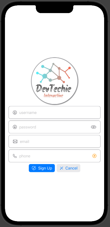
Custom TextFields UI
If the SwiftUI’s TextField doesn’t match your style, you can always customize that for better look and feel with the combination of a few views in SwiftUI.
We will create a custom TextField’s for username, password, email and phone number, which will work as a signup page for DevTechie courses app.
struct TextFieldExample: View {

    @State private var username = ""
    @State private var password = ""
    @State private var email = ""
    @State private var phone = ""

    var body: some View {
        VStack {

            Image("dt")
                .clipShape(Circle())
                .shadow(color: Color.black, radius: 2, x: 1, y: 1)
                .overlay(Circle().stroke(Color.gray, lineWidth: 2))

            // username
            HStack {
                Image(systemName: "person.circle")
                    .foregroundColor(.gray).font(.headline)
                TextField("username", text: $username)
            }
            .padding()
            .overlay(RoundedRectangle(cornerRadius: 8).stroke(Color.gray, lineWidth: 1))
            .padding(.horizontal)

            //password
            HStack {
                Image(systemName: "lock.circle")
                    .foregroundColor(.gray).font(.headline)
                TextField("password", text: $password)
                Image(systemName: "eye.slash")
                    .foregroundColor(.gray).font(.headline)
            }
            .padding()
            .overlay(RoundedRectangle(cornerRadius: 8).stroke(Color.gray, lineWidth: 1))
            .padding(.horizontal)

            // email
            HStack {
                Image(systemName: "envelope")
                    .foregroundColor(.gray).font(.headline)
                TextField("email", text: $email)
            }
            .padding()
            .overlay(RoundedRectangle(cornerRadius: 8).stroke(Color.gray, lineWidth: 1))
            .padding(.horizontal)

            // email
            HStack {
                Image(systemName: "phone")
                    .foregroundColor(.gray).font(.headline)
                TextField("phone", text: $email)
                Button(action: {}) {
                    Image(systemName: "number.circle")
                }
                .tint(.orange)
            }
            .padding()
            .overlay(RoundedRectangle(cornerRadius: 8).stroke(Color.gray, lineWidth: 1))
            .padding(.horizontal)

            HStack {
                Button(action: {}) {
                    Label("Sign Up", systemImage: "pencil.and.outline")
                }
                .buttonStyle(.borderedProminent)


                Button(action: {}) {
                    Label("Cancel", systemImage: "pencil.slash")
                }
                .buttonStyle(.bordered)
            }
        }
    }
}
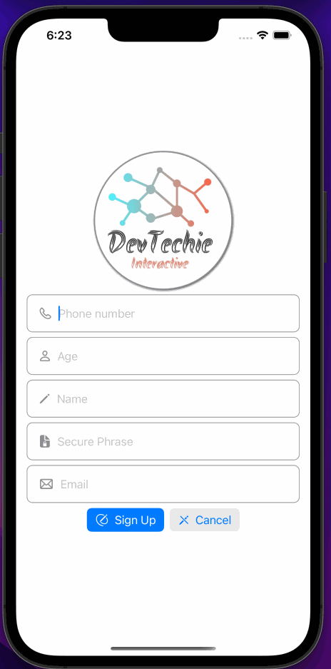
KeyboardType Modifier
TextField can display a keyboard depending upon the type of content you are expecting users to type. For example, if you are asking users to type a phone number then launch the phonePad type of keyboard.
Type of keyboard can be specified with the help of .keyboardType modifier.
For our next screen we will ask users to enter their phone number, age, name, a security phrase, email address. Which will show us a few keyboard types.
struct TextFieldExample: View {

    @State private var phone = ""
    @State private var age = ""
    @State private var name = ""
    @State private var securePhrase = ""
    @State private var email = ""

    var body: some View {
        VStack {

            Image("dt")
                .clipShape(Circle())
                .shadow(color: Color.black, radius: 2, x: 1, y: 1)
                .overlay(Circle().stroke(Color.gray, lineWidth: 2))

            // phone
            HStack {
                Image(systemName: "phone")
                    .foregroundColor(.gray).font(.headline)
                TextField("Phone number", text: $phone)
                    .keyboardType(.phonePad)
            }
            .padding()
            .overlay(RoundedRectangle(cornerRadius: 8).stroke(Color.gray, lineWidth: 1))
            .padding(.horizontal)

            //age
            HStack {
                Image(systemName: "person")
                    .foregroundColor(.gray).font(.headline)
                TextField("Age", text: $age)
                    .keyboardType(.numberPad)
            }
            .padding()
            .overlay(RoundedRectangle(cornerRadius: 8).stroke(Color.gray, lineWidth: 1))
            .padding(.horizontal)

            // name
            HStack {
                Image(systemName: "pencil")
                    .foregroundColor(.gray).font(.headline)
                TextField("Name", text: $name)
                    .keyboardType(.alphabet)
            }
            .padding()
            .overlay(RoundedRectangle(cornerRadius: 8).stroke(Color.gray, lineWidth: 1))
            .padding(.horizontal)

            // secure phrase
            HStack {
                Image(systemName: "lock.doc.fill")
                    .foregroundColor(.gray).font(.headline)
                TextField("Secure Phrase", text: $securePhrase)
                    .keyboardType(.asciiCapable)
            }
            .padding()
            .overlay(RoundedRectangle(cornerRadius: 8).stroke(Color.gray, lineWidth: 1))
            .padding(.horizontal)

            // secure phrase
            HStack {
                Image(systemName: "envelope")
                    .foregroundColor(.gray).font(.headline)
                TextField("Email", text: $email)
                    .keyboardType(.emailAddress)
            }
            .padding()
            .overlay(RoundedRectangle(cornerRadius: 8).stroke(Color.gray, lineWidth: 1))
            .padding(.horizontal)

            HStack {
                Button(action: {}) {
                    Label("Sign Up", systemImage: "pencil.and.outline")
                }
                .buttonStyle(.borderedProminent)


                Button(action: {}) {
                    Label("Cancel", systemImage: "pencil.slash")
                }
                .buttonStyle(.bordered)
            }
        }
    }
}
Supported keyboard types are:
- .default : Default type for current input method
- .asciiCapable : Displays a keyboard which can enter ASCII characters
- .numbersAndPunctuation : Displays Numbers and assorted punctuation
- .URL : A type optimized for URL entry (shows . / .com prominently)
- .numberPad : A number pad with locale-appropriate digits (0–9, ۰-۹, ०-९, etc.). Suitable for PIN entry
- .phonePad : A phone pad (1–9, *, 0, #, with letters under the numbers)
- .namePhonePad : A type optimized for entering a person’s name or phone number
- .emailAddress : A type optimized for multiple email address entry (shows space @ . prominently)
- .decimalPad : A number pad with a decimal point
- .twitter : A type optimized for twitter text entry (easy access to @ #)
- .webSearch : A default keyboard type with URL-oriented addition (shows space . prominently)
- .asciiCapableNumberPad : A number pad (0–9) that will always be ASCII digits.
- .alphabet : Displays a keyboard which can enter alphabetic characters, use .asciiCapable instead.
TextField and Keyboard
When SwiftUI was introduced TextField and Software keyboard on iOS didn’t play very well together. You would have to come up with all kinds of observers to listen for keyboard open/close events and work around that. Well that has changed, starting with iOS 14 SwiftUI has solved this problem. There is no extra work needed from our side, as long as the view is inside safeArea, TextField will move up to allow keyboard space and you would still be able to type and see what’s being typed in TextField.
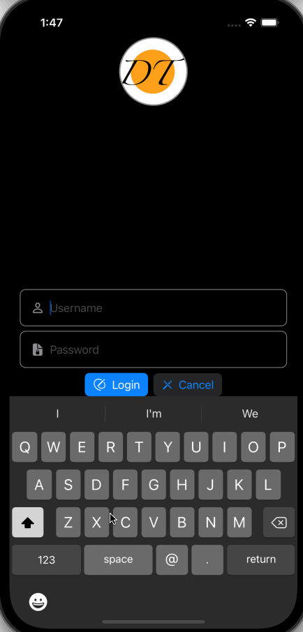
For this example, we will push our username, password fields down so when TextField is focused, the keyboard can push TextFields up so they can stay visible.
struct TextFieldExample: View {

    @State private var username = ""
    @State private var password = ""

    var body: some View {
        VStack {

            Image("dt")
                .resizable()
                .frame(width: 100, height: 100)
                .clipShape(Circle())
                .shadow(color: Color.black, radius: 2, x: 1, y: 1)
                .overlay(Circle().stroke(Color.gray, lineWidth: 2))Spacer()

            //username
            HStack {
                Image(systemName: "person")
                    .foregroundColor(.gray).font(.headline)
                TextField("Username", text: $username)
                    .keyboardType(.emailAddress)
            }
            .padding()
            .overlay(RoundedRectangle(cornerRadius: 8).stroke(Color.gray, lineWidth: 1))
            .padding(.horizontal)


            // password
            HStack {
                Image(systemName: "lock.doc.fill")
                    .foregroundColor(.gray).font(.headline)
                TextField("Password", text: $password)
                    .keyboardType(.asciiCapable)
            }
            .padding()
            .overlay(RoundedRectangle(cornerRadius: 8).stroke(Color.gray, lineWidth: 1))
            .padding(.horizontal)

            HStack {
                Button(action: {}) {
                    Label("Login", systemImage: "pencil.and.outline")
                }
                .buttonStyle(.borderedProminent)


                Button(action: {}) {
                    Label("Cancel", systemImage: "pencil.slash")
                }
                .buttonStyle(.bordered)
            }
        }
    }
}
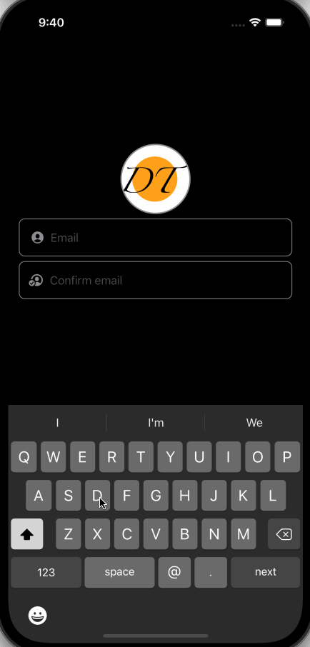
Change observers for TextField
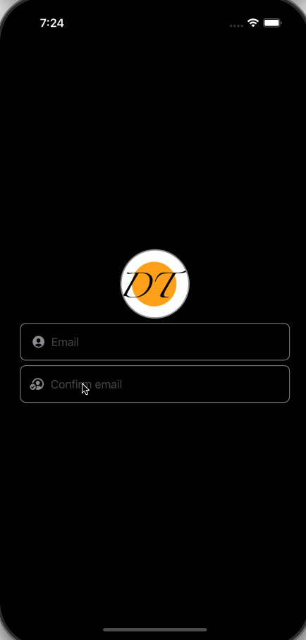
Enable/Disable TextField
TextField works well with SwiftUI’s .disabled modifier.
Let’s say we want users to confirm their email address but we only want to enable confirm email TextField when the user has entered a value in email TextField, for this use case, we can use disabled modifier as shown below.
struct TextFieldExample: View {

    @State private var email = ""
    @State private var confirmEmail = ""

    var body: some View {
        VStack {

            Image("dt")
                .resizable()
                .frame(width: 100, height: 100)
                .clipShape(Circle())
                .shadow(color: Color.black, radius: 2, x: 1, y: 1)
                .overlay(Circle().stroke(Color.gray, lineWidth: 2))//username
            HStack {
                Image(systemName: "person.crop.circle.fill")
                    .foregroundColor(.gray).font(.headline)
                TextField("Email", text: $email)
                    .keyboardType(.emailAddress)
            }
            .padding()
            .overlay(RoundedRectangle(cornerRadius: 8).stroke(Color.gray, lineWidth: 1))
            .padding(.horizontal)


            // password
            HStack {
                Image(systemName: "person.crop.circle.badge.checkmark")
                    .foregroundColor(.gray).font(.headline)
                TextField("Confirm email", text: $confirmEmail)
                    .keyboardType(.emailAddress)
                    .disabled(email.isEmpty)
            }
            .padding()
            .overlay(RoundedRectangle(cornerRadius: 8).stroke(Color.gray, lineWidth: 1))
            .padding(.horizontal)

        }
    }
}
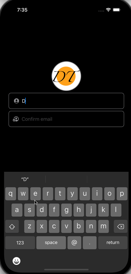
OnSubmit modifier for TextField
TextField’s OnSubmit modifier can be used to perform the desired operation when the keyboard’s return key is pressed.
For our example, we can validate the email address field when the return key is pressed to make sure email and confirm email are the same.
We will create a function to compare email and confirm email and change TextField’s border color based on the comparison results.
struct TextFieldExample: View {

    @State private var email = ""
    @State private var confirmEmail = ""
    @State private var borderColor: Color = .gray

    var body: some View {
        VStack {

            Image("dt")
                .resizable()
                .frame(width: 100, height: 100)
                .clipShape(Circle())
                .shadow(color: Color.black, radius: 2, x: 1, y: 1)
                .overlay(Circle().stroke(Color.gray, lineWidth: 2))//username
            HStack {
                Image(systemName: "person.crop.circle.fill")
                    .foregroundColor(.gray).font(.headline)
                TextField("Email", text: $email)
                    .keyboardType(.emailAddress)
            }
            .padding()
            .overlay(RoundedRectangle(cornerRadius: 8).stroke(borderColor, lineWidth: 1))
            .padding(.horizontal)


            // password
            HStack {
                Image(systemName: "person.crop.circle.badge.checkmark")
                    .foregroundColor(.gray).font(.headline)
                TextField("Confirm email", text: $confirmEmail)
                    .keyboardType(.emailAddress)
                    .disabled(email.isEmpty)
                    .onSubmit {
                        validateEmail()
                    }
            }
            .padding()
            .overlay(RoundedRectangle(cornerRadius: 8).stroke(borderColor, lineWidth: 1))
            .padding(.horizontal)
        }
    }

    private func validateEmail() {
        if email.localizedCaseInsensitiveCompare(confirmEmail) == .orderedSame {
            borderColor = .green
        } else {
            borderColor = .red
        }
    }
}
OnSubmitLabel for TextField
SwiftUI 3 introduced the ability to change return key label text to some of the predefined values with a modifier called submitLabel; it’s an enum with the values of join, return, continue, done, go, next, route, search and send.
We will add labels for email and confirm the email field. Return key label for the email will be called “next” and “done” for the confirm email TextField.
struct TextFieldExample: View {

    @State private var email = ""
    @State private var confirmEmail = ""
    @State private var borderColor: Color = .gray

    var body: some View {
        VStack {

            Image("dt")
                .resizable()
                .frame(width: 100, height: 100)
                .clipShape(Circle())
                .shadow(color: Color.black, radius: 2, x: 1, y: 1)
                .overlay(Circle().stroke(Color.gray, lineWidth: 2))HStack {
                Image(systemName: "person.crop.circle.fill")
                    .foregroundColor(.gray).font(.headline)
                TextField("Email", text: $email)
                    .keyboardType(.emailAddress)
                    .submitLabel(.next)
            }
            .padding()
            .overlay(RoundedRectangle(cornerRadius: 8).stroke(borderColor, lineWidth: 1))
            .padding(.horizontal)

            HStack {
                Image(systemName: "person.crop.circle.badge.checkmark")
                    .foregroundColor(.gray).font(.headline)
                TextField("Confirm email", text: $confirmEmail)
                    .keyboardType(.emailAddress)
                    .disabled(email.isEmpty)
                    .onSubmit {
                        validateEmail()
                    }
                    .submitLabel(.done)
            }
            .padding()
            .overlay(RoundedRectangle(cornerRadius: 8).stroke(borderColor, lineWidth: 1))
            .padding(.horizontal)
        }
    }

    private func validateEmail() {
        if email.localizedCaseInsensitiveCompare(confirmEmail) == .orderedSame {
            borderColor = .green
        } else {
            borderColor = .red
        }
    }
}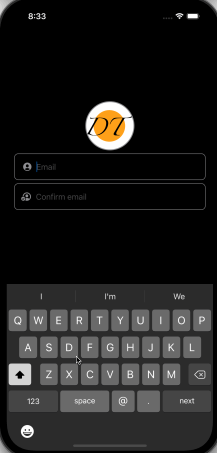
Our return key label reads “next” but it dismisses the keyboard upon tapping instead of going to the next TextField. This is where SwiftUI 3’s new modifier .focused and newly introduced property wrapper @FocusState can help us.
Focused and FocusState for TextField
Introduced in iOS 15, Focused modifier along with FocusState property wrapper can help you manage focus on TextField. You can use this combination to cycle through TextFields and place better validation in place by asking users to enter all required information before moving forward.
To better understand, we will continue to work on email and confirm email TextFields. When the user taps on the return key, we will move focus to the next TextField(confirm email). We will create a FocusState variable called focusConfirm which will be set to true when the user taps on next(return key) while focus is on email TextField, .focused modifier on confirm email TextField will gain focus as soon as FocusState changes the value.
struct TextFieldExample: View {

    @State private var email = ""
    @State private var confirmEmail = ""
    @State private var borderColor: Color = .gray

    @FocusState private var focusConfirm: Bool

    var body: some View {
        VStack {

            Image("dt")
                .resizable()
                .frame(width: 100, height: 100)
                .clipShape(Circle())
                .shadow(color: Color.black, radius: 2, x: 1, y: 1)
                .overlay(Circle().stroke(Color.gray, lineWidth: 2))HStack {
                Image(systemName: "person.crop.circle.fill")
                    .foregroundColor(.gray).font(.headline)
                TextField("Email", text: $email)
                    .keyboardType(.emailAddress)
                    .submitLabel(.next)
                    .onSubmit {
                        focusConfirm = true
                    }
            }
            .padding()
            .overlay(RoundedRectangle(cornerRadius: 8).stroke(borderColor, lineWidth: 1))
            .padding(.horizontal)

            HStack {
                Image(systemName: "person.crop.circle.badge.checkmark")
                    .foregroundColor(.gray).font(.headline)
                TextField("Confirm email", text: $confirmEmail)
                    .keyboardType(.emailAddress)
                    .disabled(email.isEmpty)
                    .onSubmit {
                        validateEmail()
                    }
                    .submitLabel(.done)
                    .focused($focusConfirm)
            }
            .padding()
            .overlay(RoundedRectangle(cornerRadius: 8).stroke(borderColor, lineWidth: 1))
            .padding(.horizontal)
        }
    }

    private func validateEmail() {
        if email.localizedCaseInsensitiveCompare(confirmEmail) == .orderedSame {
            borderColor = .green
        } else {
            borderColor = .red
        }
    }
}
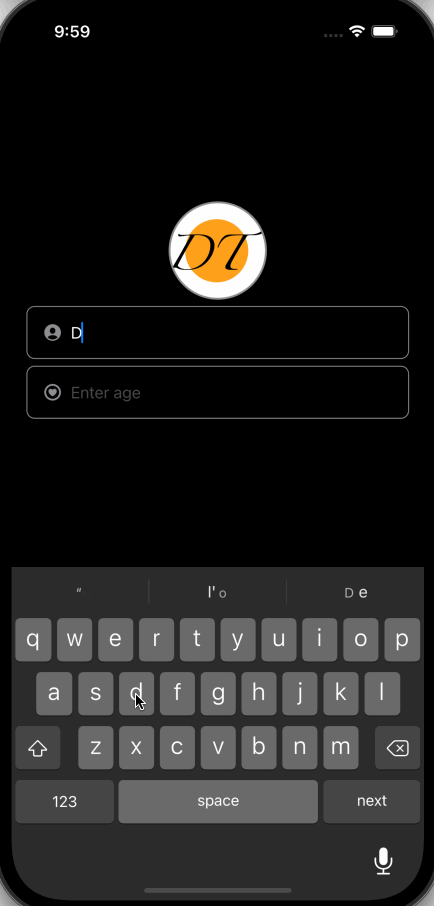
OnChange for TextField
Imagine a scenario where you want to limit your TextField’s input count to a certain number. For example, you are expecting user’s firstName to be 100 chars long(for better indexing and optimization on Database side), you have two choices, truncate input once user finished editing the field(use OnSubmit for that) or observe what’s being typed in TextField, keep a counter and once the counter reaches the limit, stop taking input. This is where the onChange observer can be helpful. You can observe input from the user via onChange and react to it. Another use-case could be to only allow certain character types to be typed into the field.
For our example, we will limit the user’s first name to 10 char counts and ask them for their age(Numeric Chars).
struct TextFieldExample: View {

    @State private var firstName: String = ""
    @State private var age: String = ""

    @FocusState private var focusAge: Bool

    var body: some View {
        VStack {

            Image("dt")
                .resizable()
                .frame(width: 100, height: 100)
                .clipShape(Circle())
                .shadow(color: Color.black, radius: 2, x: 1, y: 1)
                .overlay(Circle().stroke(Color.gray, lineWidth: 2))HStack {
                Image(systemName: "person.crop.circle.fill")
                    .foregroundColor(.gray).font(.headline)
                TextField("First Name", text: $firstName)
                    .keyboardType(.asciiCapable)
                    .submitLabel(.next)
                    .onSubmit {
                        focusAge = true
                    }
                    .onChange(of: firstName) { newValue in
                        firstName = String(newValue.prefix(10))
                    }
            }
            .padding()
            .overlay(RoundedRectangle(cornerRadius: 8).stroke(.gray, lineWidth: 1))
            .padding(.horizontal)

            HStack {
                Image(systemName: "heart.circle")
                    .foregroundColor(.gray).font(.headline)
                TextField("Enter age", text: $age)
                    .keyboardType(.emailAddress)
                    .submitLabel(.done)
                    .focused($focusAge)
                    .onChange(of: age) { newValue in
                        let filtered = newValue.filter { $0.isNumber }
                        if newValue != filtered {
                            age = filtered
                        }
                    }
            }
            .padding()
            .overlay(RoundedRectangle(cornerRadius: 8).stroke(.gray, lineWidth: 1))
            .padding(.horizontal)
        }
    }
}
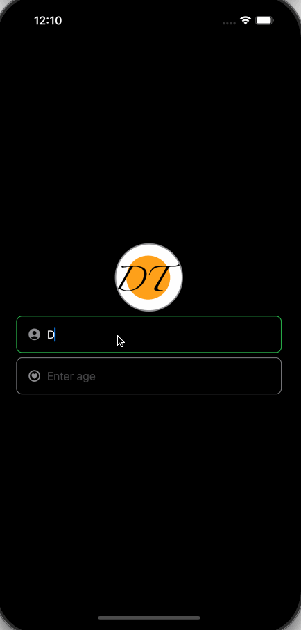
OnEditingChange for TextField
TextField has another observer which can tell us when the field is being edited or not. With the help of OnEditingChange, we can create a better experience for the user by highlighting TextField being edited.
We will use onEditingChange to draw borders around our TextField when it’s being edited.
struct TextFieldExample: View {

    @State private var firstName: String = ""
    @State private var age: String = ""

    @State private var firstNameEditing = false
    @State private var ageEditing = false

    var body: some View {
        VStack {

            Image("dt")
                .resizable()
                .frame(width: 100, height: 100)
                .clipShape(Circle())
                .shadow(color: Color.black, radius: 2, x: 1, y: 1)
                .overlay(Circle().stroke(Color.gray, lineWidth: 2))HStack {
                Image(systemName: "person.crop.circle.fill")
                    .foregroundColor(.gray).font(.headline)
                TextField("First Name", text: $firstName, onEditingChanged: { isEditing in
                    firstNameEditing = isEditing
                })
                    .keyboardType(.asciiCapable)
                    .submitLabel(.next)
            }
            .padding()
            .overlay(RoundedRectangle(cornerRadius: 8).stroke(firstNameEditing ? .green : .gray, lineWidth: 1))
            .padding(.horizontal)

            HStack {
                Image(systemName: "heart.circle")
                    .foregroundColor(.gray).font(.headline)
                TextField("Enter age", text: $age, onEditingChanged: { isEditing in
                    ageEditing = isEditing
                })
                    .keyboardType(.numberPad)
                    .submitLabel(.done)

            }
            .padding()
            .overlay(RoundedRectangle(cornerRadius: 8).stroke(ageEditing ? .green : .gray, lineWidth: 1))
            .padding(.horizontal)
        }
    }
}
With that, we have reached the end of this article. Thank you once again for reading.