SwiftUI Label: a closer look
DevTechie Inc
DevTechie Inc
SwiftUI Label was introduced in iOS 14. Label groups title and icon(image) together into a single view.
The Basics
In its simplest form, label can be created by providing text and systemImage as shown below:
Label("DevTechie", systemImage: "star.fill")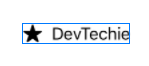
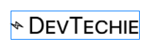
Label with custom views
If you need more control over title and icon, you can use other overload of init which supports ViewBuilder closure. It’s signature looks like this:
public init(@ViewBuilder title: () -> Title, @ViewBuilder icon: () -> Icon)
You can use this to create custom views for title and icon.
Label {
    Text("DevTechie")
        .font(.largeTitle.lowercaseSmallCaps())
} icon: {
    Image(systemName: "bolt")
        .rotationEffect(.degrees(-90))
}
Label with Asset Image
Label supports not only SF symbols but it also supports image from Assets catalog. I have DevTechie logo in my Assets so I will use that in my label.
Label("DevTechie", image: "dt")
But there is an issue here(did you notice 😄). Our image is rendered with its original size.
Label doesn’t resize images so if you need to display image next to title, you will have to take matters in your hand. You have two choices:
Resize image inside ViewBuilder overload of init:
Label {
    Text("DevTechie")
        .font(.largeTitle.lowercaseSmallCaps())
} icon: {
    Image("dt")
        .resizable()
        .frame(width: 40, height: 40)
        .clipShape(Circle())
}
Or change size in Asset catalog and use it directly.
LabelStyle
SwiftUI Label gives you ability to create custom styles with the help of LabelStyle protocol.
Protocol’s only requirement is to provide definition for makeBody function.
@ViewBuilder func makeBody(configuration: Self.Configuration) -> Self.Body
Configuration parameter is of type LabelStyleConfiguration, which gives access to icon and title of Label. So we have everything we need to customize our label:
struct CustomLabelStyle: LabelStyle {
    let iconColor: Color
    let titleColor: Color
    let backgroundColor: Color

    func makeBody(configuration: Configuration) -> some View {
        HStack {
            configuration.icon
                .foregroundColor(iconColor)

            configuration.title
                .foregroundColor(titleColor)
                .padding(.leading, 10)
                .lineLimit(1)

            configuration.icon
                .foregroundColor(iconColor)
        }
        .padding(10)
        .background(RoundedRectangle(cornerRadius: 10).fill(backgroundColor.opacity(0.2)))
    }
}
In the code above, we are expecting three parameters and all are Color type to customize the look of our label. Inside makeBody function we will extract out icon and title from configuration object and style them. Once style is created we can use it as below:
Label("DevTechie", systemImage: "heart.fill")
.labelStyle(CustomLabelStyle(iconColor: .red, titleColor: .orange, backgroundColor: .teal))
.font(.largeTitle)
Output:

LabelStyle to show/hide components
LabelStyle have predefined enum to show different components of Label:
struct LabelExample1: View {
    var body: some View {
        VStack {
            Label("DevTechie", systemImage: "heart.fill")
            .labelStyle(.iconOnly)
            .foregroundColor(.orange)

            Label("DevTechie", systemImage: "heart.fill")
                .labelStyle(.titleAndIcon)
                .foregroundColor(.blue)

            Label("DevTechie", systemImage: "heart.fill")
                .labelStyle(.titleOnly)
                .foregroundColor(.green)

            Label("DevTechie", systemImage: "heart.fill")
            .labelStyle(.automatic)
            .foregroundColor(.purple)

        }.font(.largeTitle)
    }
}
Output:

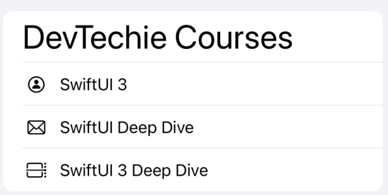
Labels in List
Labels in list provide consistent alignment hence improving visual appearance.
List without Label:
List {
    Text("DevTechie Courses")
        .font(.largeTitle)HStack {
        Image(systemName: "person.circle")
        Divider()
        Text("SwiftUI 3")
    }HStack {
        Image(systemName: "envelope")
        Divider()
        Text("SwiftUI Deep Dive")
    }HStack {
        Image(systemName: "calendar.day.timeline.right")
        Divider()
        Text("SwiftUI Deep Dive")
    }
}
Notice Divider, its not aligned between rows.
Change HStack to Label:
List {
    Text("DevTechie Courses")
        .font(.largeTitle)Label {
        Text("SwiftUI 3")
    } icon: {
        Image(systemName: "person.circle")
            .foregroundColor(.primary)
    }Label {
        Text("SwiftUI Deep Dive")
    } icon: {
        Image(systemName: "envelope")
            .foregroundColor(.primary)
    }Label {
        Text("SwiftUI 3 Deep Dive")
    } icon: {
        Image(systemName: "calendar.day.timeline.right")
            .foregroundColor(.primary)
    }}
With that, we have reached the end of this article. Thank you once again for reading, if you liked it, don’t forget to subscribe our newsletter.