SwiftUI HStack: a closer look

HStack is a layout container used to layout child views in horizontal direction. Child views appear side by side from leading to trailing direction next to each other.
The Basics
Let’s start with a simple example. We will create HStack and add two child Text views.
struct HStackExample: View {
    var body: some View {
        HStack {
            Text("DevTechie")
                .font(.largeTitle)
            Text("Learn by example")
                .font(.title3)
        }
    }
}
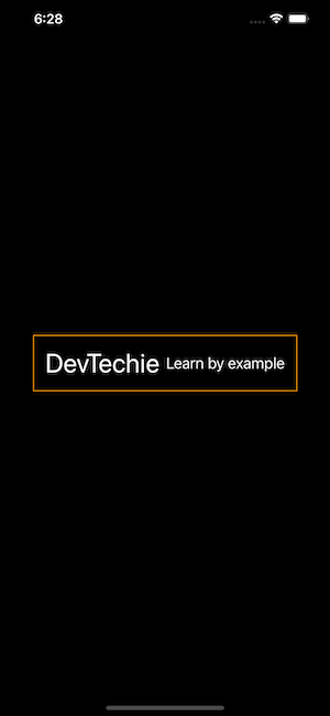
Similar to VStack , HStack also takes only the space needed for it to display the content.
struct HStackExample1: View {
    var body: some View {
        HStack {
            Text("DevTechie")
                .font(.largeTitle)
            Text("Learn by example")
                .font(.title3)
        }
        .padding()
        .border(Color.orange)
    }
}
Nesting of HStacks
HStack can contain up to 10 static views, if you need more static views, you can nest HStack inside another HStack or Group to nest views inside.
struct HStackExample1: View {
    var body: some View {
        HStack {
            Text("D")
                .font(.system(size: 38))
            Text("E")
                .font(.system(size: 34))
            Text("V")
                .font(.system(size: 30))

            HStack {
                Text("T")
                    .font(.system(size: 26))
                Text("E")
                    .font(.system(size: 22))
                Text("C")
                    .font(.system(size: 18))
            }

            Group {
                Text("H")
                    .font(.system(size: 14))
                Text("I")
                    .font(.system(size: 10))
                Text("E")
                    .font(.system(size: 6))
            }
        }
        .padding()
        .border(Color.orange)
    }
}
Spacing
Spacing between all child views can be changed with the help of spacing parameter. HStack takes spacing as initparameter and can be used as shown in the example below. We will also throw in a little animation for spacing as well in combination with newly introduced task modifier
struct HStackExample1: View {
    @State private var spacing: CGFloat = 1.0
    var body: some View {
        HStack(spacing: spacing) {
            Text("D")
                .font(.system(size: 38))
            Text("E")
                .font(.system(size: 34))
            Text("V")
                .font(.system(size: 30))
            Text("T")
                .font(.system(size: 26))
            Text("E")
                .font(.system(size: 22))
            Text("C")
                .font(.system(size: 18))
            Text("H")
                .font(.system(size: 14))
            Text("I")
                .font(.system(size: 10))
            Text("E")
                .font(.system(size: 6))
        }
        .padding()
        .border(Color.orange)
        .task {
            spacing = spacing == 1 ? 20 : 1
        }
        .animation(Animation.easeInOut(duration: 2).repeatForever(), value: spacing)
    }
}
Alignment
HStack uses VerticalAlignment to align its child views. By default child views are center aligned. Other options are top, center, bottom, firstTextBaseline, and lastTextBaseline
Since HStack takes only as much space as needed, in order for us to see alignment change properly, we will have to make one text larger then other.
We will create alignmentProp of type VerticalAlignment so we can control alignment with the tap on a button. We will also be adding animation modifier to make alignment transition smoother.
struct HStackExample1: View {

    @State private var alignmentProp: VerticalAlignment = .center

    var body: some View {
        VStack {
            HStack (alignment: alignmentProp) {
                VStack {
                    Text("DevTechie")
                    Text("Learn by example")
                }.font(.largeTitle)

                HStack {
                    Text("SwiftUI")
                    Text("Swift")
                    Text("iOS")
                }.padding(10)
                    .background(Color.blue)
            }
            .frame(maxWidth: .infinity)
            .background(Color.orange)
            .animation(.easeInOut, value: alignmentProp)

            ControlGroup {
                Button("Top") {
                    alignmentProp = .top
                }

                Button("Center") {
                    alignmentProp = .center
                }

                Button("Bottom") {
                    alignmentProp = .bottom
                }

                Button("First Text") {
                    alignmentProp = .firstTextBaseline
                }

                Button("Last Text") {
                    alignmentProp = .lastTextBaseline
                }
            }
            .padding(20)

        }
    }
}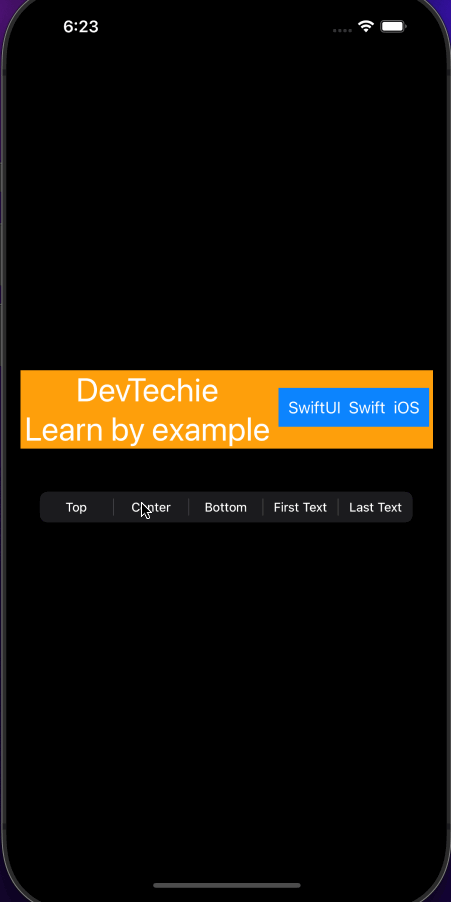
Notice: use of firstTextAlignment and lastTextAlignment. firstTextAlignment will align bottom of “SwiftUI, Swift, iOS” text to the bottom of first text which is “DevTechie”. lastTextAlignment will align bottom of “SwiftUI, Swift, iOS” text to the bottom of last text, which is “Learn by example.”
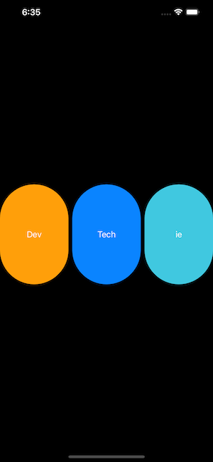
LayoutPriority
Child views inside HStack have same priority so the space is distributed by parent accordingly. If child view requires different priority, that can be indicated by the use of layoutPriority modifier.
Let’s start with example where views are distributed equal width inside HStack:
struct HStackExample1: View {

    var body: some View {
        HStack {
            Capsule()
                .fill(Color.orange)
                .overlay(Text("Dev"))

            Capsule()
                .fill(Color.blue)
                .overlay(Text("Tech"))

            Capsule()
                .fill(Color.teal)
                .overlay(Text("ie"))
        }
        .frame(maxHeight: 200)
    }
}
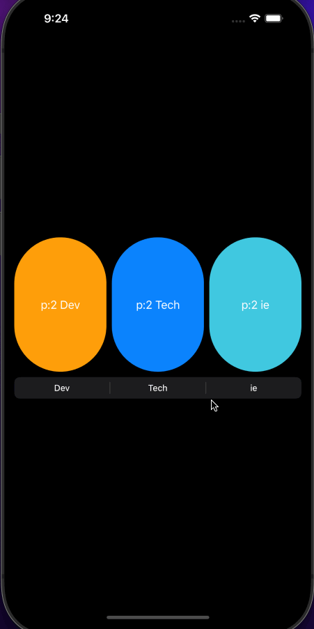
Let’s add layoutPriority into the mix:
struct HStackExample1: View {

    @State private var devPriority: CGFloat = 1.0
    @State private var techPriority: CGFloat = 1.0
    @State private var iePriority: CGFloat = 1.0

    var body: some View {
        HStack {
            Capsule()
                .fill(Color.orange)
                .overlay(Text("p:\(Int(devPriority)) Dev"))
                .layoutPriority(devPriority)
                .animation(.easeInOut, value: devPriority)

            Capsule()
                .fill(Color.blue)
                .overlay(Text("p:\(Int(techPriority)) Tech"))
                .layoutPriority(techPriority)
                .animation(.easeInOut, value: techPriority)

            Capsule()
                .fill(Color.teal)
                .overlay(Text("p:\(Int(iePriority)) ie"))
                .layoutPriority(iePriority)
                .animation(.easeInOut, value: iePriority)
        }
        .frame(maxHeight: 200)

        ControlGroup {
            Button("Dev") {
                devPriority = devPriority == 1.0 ? 2.0 : 1.0
            }

            Button("Tech") {
                techPriority = techPriority == 1.0 ? 2.0 : 1.0
            }

            Button("ie") {
                iePriority = iePriority == 1.0 ? 2.0 : 1.0
            }
        }}
}
Notice how higher priority takes over entire row? We can prevent that from happening by specifying minWidth for each capsule view.
struct HStackExample1: View {

    @State private var devPriority: CGFloat = 1.0
    @State private var techPriority: CGFloat = 1.0
    @State private var iePriority: CGFloat = 1.0

    var body: some View {
        HStack {
            Capsule()
                .fill(Color.orange)
                .overlay(Text("p:\(Int(devPriority)) Dev"))
                .frame(minWidth: 20)
                .layoutPriority(devPriority)
                .animation(.easeInOut, value: devPriority)

            Capsule()
                .fill(Color.blue)
                .frame(minWidth: 20)
                .overlay(Text("p:\(Int(techPriority)) Tech"))
                .layoutPriority(techPriority)
                .animation(.easeInOut, value: techPriority)

            Capsule()
                .fill(Color.teal)
                .frame(minWidth: 20)
                .overlay(Text("p:\(Int(iePriority)) ie"))
                .layoutPriority(iePriority)
                .animation(.easeInOut, value: iePriority)
        }
        .frame(maxHeight: 200)

        ControlGroup {
            Button("Dev") {
                devPriority = devPriority == 1.0 ? 2.0 : 1.0
            }

            Button("Tech") {
                techPriority = techPriority == 1.0 ? 2.0 : 1.0
            }

            Button("ie") {
                iePriority = iePriority == 1.0 ? 2.0 : 1.0
            }
        }}
}
We can use layoutPriority to make sure content is displayed properly. For our example, I will take four Text views to see layoutPriority in action:
struct HStackExample1: View {

    var body: some View {
        HStack {
            Text("DevTechie")
                .font(.largeTitle)
            Text("Learn by example")
            Text("SwiftUI, Swift, iOS")
            Text("Without priority")
        }
        .frame(maxHeight: 200)
    }
}
Notice how we have text wrap itself to grow in vertical direction to make room for all the other text views. Let’s say, we wanna make sure that DevTechie and Without priority text should always appear in single line, we can achieve that with layoutPriority:
struct HStackExample1: View {

    var body: some View {
        HStack {
            Text("DevTechie")
                .font(.largeTitle)
                .layoutPriority(2)
            Text("Learn by example")
            Text("SwiftUI, Swift, iOS")
            Text("Without priority")
                .layoutPriority(2)
        }
        .frame(maxHeight: 200)
    }
}
With that, we have reached the end of this article. Thank you once again for reading, if you liked it, don’t forget to subscribe our newsletter.