ProgressView in SwiftUI

Progress view in SwiftUI is used to indicate the “progress” toward a task completion 😃 

Progress view comes in two flavors 😋 there is a version which show indeterminate progress as shown below:

struct ProgressViewExample: View {
    
    var body: some View {
        ProgressView("Loading... Please wait.")
    }
}

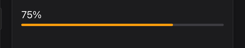
Other version of Progress view shows percent completion. We will use a state variable called progress . Will use Slider view to change progress variable’s value. We will also use progress view’s label to show overall completion percentage.

struct ProgressViewExample: View {
    @State private var progress = 0.5
    var body: some View {
        VStack {
            Spacer()
            ProgressView.init(value: progress) {
                Text("Almost done: \(String(format: "%.0f%%", progress * 100))")
            }
            Spacer()
            Slider(value: $progress, in: 0...1)
        }
        .tint(.orange)
        .padding()
    }
}
ProgressViewStyle
Progress view comes with two built-in styles, circular and linear progress style. If you have progress view initialized with a value then linear style becomes default for progress view. If only label is defined then circular progress view is created. 

Example with progress value:

struct ProgressViewExample: View {
    @State private var progress = 0.75
    var body: some View {
        VStack {
            ProgressView(value: progress) {
                Text("\(String(format: "%.0f%%", progress * 100))")
            }
        }
        .tint(.orange)
        .padding()
    }
}
Example with label

struct ProgressViewExample: View {
    @State private var progress = 0.5
    var body: some View {
        VStack {
            ProgressView("Loading...")
        }
        .tint(.orange)
        .padding()
    }
}

We can also set style with the help of progressViewStyle as shown below
Linear Progress Style with progress value

struct ProgressViewExample: View {
    @State private var progress = 0.5
    var body: some View {
        VStack {
            Spacer()
            ProgressView(value: progress) {
                Text("\(String(format: "%.0f%%", progress * 100))")
            }
            .progressViewStyle(.linear)
            Spacer()
            Slider(value: $progress, in: 0...1)
        }
        .tint(.orange)
        .padding()
    }
}

Circular Progress View with progress value

struct ProgressViewExample: View {
    @State private var progress = 0.5
    var body: some View {
        VStack {
            Spacer()
            ProgressView(value: progress) {
                Text("\(String(format: "%.0f%%", progress * 100))")
            }
            .progressViewStyle(.circular)
            Spacer()
            Slider(value: $progress, in: 0...1)
        }
        .tint(.orange)
        .padding()
    }
}
Custom ProgressStyle

We can even extend progress view style protocol with our own custom implementation. We will implement circular progress bar with progress percentage at the center of the circle. 

public struct CircularProgressViewStyle: ProgressViewStyle {
    var size: CGFloat
    private let lineWidth: CGFloat = 20 
    private let defaultProgress = 0.0
    private let gradient = LinearGradient(colors: [.purple, .blue], startPoint: .leading, endPoint: .trailing)
    
    public func makeBody(configuration: ProgressViewStyleConfiguration) -> some View {
        ZStack {
            configuration.label
            progressCircleView(fractionCompleted: configuration.fractionCompleted ?? defaultProgress)
            configuration.currentValueLabel
        }
    }
    
    private func progressCircleView(fractionCompleted: Double) -> some View {
        Circle()
            .stroke(gradient, lineWidth: lineWidth)
            .opacity(0.2)
            .overlay(progressFill(fractionCompleted: fractionCompleted))
            .frame(width: size, height: size)
    }
    
    private func progressFill(fractionCompleted: Double) -> some View {
        Circle()
            .trim(from: 0, to: CGFloat(fractionCompleted))
            .stroke(gradient, lineWidth: lineWidth)
            .frame(width: size)
            .rotationEffect(.degrees(-90))
    }
}

With that we have reached the end of this article. Thank you once again for reading. If you liked this, don’t forget to subscribe our weekly newsletter at https://www.devtechie.com