New in SwiftUI 4 : toolbarColorScheme
DevTechie Inc
Dec 7, 2022

preferredColorScheme modifier was introduced in iOS 13 and has been a way to fix dark or light mode for SwiftUI views.preferredColorScheme applies scheme to the entire view but what if you want to mix and match for your navigation view and content view, this is where toolbarColorScheme comes into picture.
Starting iOS 16 and SwiftUI 4, we can specifies the preferred color scheme of a bar managed by SwiftUI.
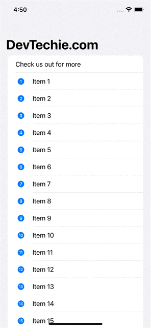
Let’s start with an example where we will set view’s color scheme as light and NavigationBar scheme to dark mode.
struct NavigationBarSchemeExample: View {
    var body: some View {
        NavigationStack {
            List {
                Text("Check us out for more")
                ForEach(1..<50, id: \.self) { idx in
                    Label("Item \(idx)", systemImage: "\(idx).circle.fill")
                }
            }
            .navigationTitle("DevTechie.com")
            .preferredColorScheme(.light)
            .toolbarColorScheme(.dark, in: .navigationBar)
        }
    }
}
We can even customize the background with another modifier for toolbar called toolbarBackground . Let’s update our example to see this in action.
struct NavigationBarSchemeExample: View {
    var body: some View {
        NavigationStack {
            List {
                Text("Check us out for more")
                ForEach(1..<50, id: \.self) { idx in
                    Label("Item \(idx)", systemImage: "\(idx).circle.fill")
                }
            }
            .navigationTitle("DevTechie.com")
            .preferredColorScheme(.light)
            .toolbarColorScheme(.dark, in: .navigationBar)
            .toolbarBackground(Color.orange)
        }
    }
}
With that we have reached the end of this article. Thank you once again for reading. Don’t forget to follow 😍. Also subscribe our newsletter at https://www.devtechie.com