Let’s Build Activity Ring in SwiftUI
DevTechie Inc
Jun 24, 2022
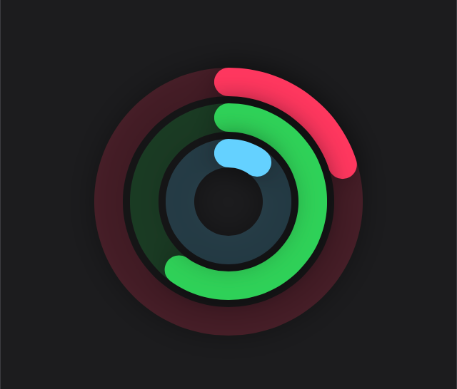
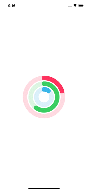
In this article, we will replicate the activity ring from Apple Watch in SwiftUI.
Let’s get started. We will start by building a path in a custom shape struct. This shape will draw an arc path for the ring shape. This shape will take percent as a parameter; this parameter will represent the overall percentage completed for a given ring.
struct RingPath: Shape {
    var percent: Double

    func path(in rect: CGRect) -> Path {
        Path { path in

        }
    }
}
We will add an arc path where arc’s
- center will be middle of the rect
- radius will be half of rect’s width
- startAngle will be -90 degrees so our ring can start from top
- endAngle will be computed from percent, and the startAngle value
- clockwise will be false
struct RingPath: Shape {
    var percent: Double

    func path(in rect: CGRect) -> Path {
        Path { path in
            path.addArc(
                center: CGPoint(x: rect.width / 2, y: rect.height / 2),
                radius: rect.width / 2,
                startAngle: Angle(degrees: -90),
                endAngle: Angle(degrees: ((percent / 100 * 360) + -90)),
                clockwise: false)
        }
    }
}
Since percent is the value which will change overtime, we can define that as animatable property:
struct RingPath: Shape {
    var percent: Double
    var animatableData: Double {
        get {
            percent
        }
        set {
            percent = newValue
        }
    }

    func path(in rect: CGRect) -> Path {
        Path { path in
            path.addArc(
                center: CGPoint(x: rect.width / 2, y: rect.height / 2),
                radius: rect.width / 2,
                startAngle: Angle(degrees: -90),
                endAngle: Angle(degrees: ((percent / 100 * 360) + -90)),
                clockwise: false)
        }
    }
}
Once our custom shape is ready, we can use it inside our view. We will start by building a custom ring view, which will have two ring shapes in ZStack, stacked on top of each other. First ring, will act as a track and will have opacity; second ring (one on top) will have full opacity. This view will also take ring color as a parameter along with the percent for the ring progress.
struct RingView: View {
    var percent: Double
    var ringColor: Color

    var body: some View {
        GeometryReader { proxy in
            ZStack {
                RingPath(percent: 100)
                    .stroke(style: StrokeStyle(lineWidth: 20))
                    .fill(ringColor.opacity(0.2))

                RingPath(percent: percent)
                    .stroke(style: StrokeStyle(lineWidth: 20, lineCap: .round))
                    .fill(ringColor)
            }
            .padding()
        }
    }
}
Now, let’s use the newly created RingView inside a view, we will have three rings inside a ZStack; each ring will have a different frame so all of them can be visible. This view will contain an animate state property as well, so we can animate rings on tap. Ideally, you would wanna capture percentages based on user’s health data.
struct ActivityRingSwiftUI: View {
    @State private var animate = false
    var body: some View {
        ZStack {
            RingView(percent: animate ? 100 : 20, ringColor: .pink)
                .frame(width: 200, height: 200)
            RingView(percent: animate ? 100 : 60, ringColor: .green)
                .frame(width: 150, height: 150)
            RingView(percent: animate ? 100 : 10, ringColor: .cyan)
                .frame(width: 100, height: 100)
        }
        .onTapGesture {
            withAnimation(Animation.spring()) {
                animate.toggle()
            }
        }
    }
}
With that we have reached the end of this article. Thank you once again for reading. Subscribe to our weekly newsletter at https://www.devtechie.com