- May 1
SwiftUI Tab Bar Micro-Animations with Keyframes
- DevTechie
- SwiftUI
Have you noticed how the best apps don’t just respond — they react?
A simple tap isn’t just a state change. It’s a subtle bounce, a quick scale, a tiny wobble. These micro-animations make an interface feel alive and responsive.
In this tutorial, we’ll build a custom SwiftUI tab bar where each interaction is powered by keyframe animations — turning ordinary tab switches into polished, delightful motion.
Define the tab model
Start with a simple data structure for each tab:
struct TabItem: Identifiable {
    let id = UUID()
    let icon: String
    let title: String
}
Define keyframe state
Next, create a structure to hold the animation state:
struct Keyframe {
    var scale: CGFloat = 1
    var offsetY: CGFloat = 0
    var rotation: Angle = .zero
    var reflectionOpacity: CGFloat = 0.4
}
Create the tab item view
Now, create a view for each tab item:
struct TabBarItemView: View {

    let tab: TabItem
    let isSelected: Bool
    let action: () -> Void

    @State private var triggerAnimation: Bool = false
Each tab is a button. When tapped, it toggles the animation trigger and executes the provided action:
var body: some View {
    Button {
        triggerAnimation.toggle()
        action()
    }
Add the animated icon to button: The button label is a VStack containing the icon. This is where we apply keyframeAnimator:
label: {
    VStack(spacing: 6) {

        Image(systemName: tab.icon)
            .font(.system(size: 22))
            .keyframeAnimator(
                initialValue: Keyframe(),
                trigger: triggerAnimation
            ) { view, frame in
The animator gives access to the view and its animated state. Apply scale, rotation, and offset:
view
    .scaleEffect(frame.scale)
    .rotationEffect(frame.rotation)
    .offset(y: frame.offsetY)
Add reflection effect
Use a background to create a subtle reflection:
.background {
    view
        .blur(radius: 2)
        .rotation3DEffect(
            .degrees(180),
            axis: (x: 1, y: 0, z: 0)
        )
        .mask {
            LinearGradient(
                colors: [
                    .white.opacity(frame.reflectionOpacity),
                    .clear
                ],
                startPoint: .top,
                endPoint: .bottom
            )
        }
        .offset(y: 30)
}
Define keyframes
The second closure defines the animation using KeyframeTrack:
} keyframes: { _ in

    KeyframeTrack(\.offsetY) {
        CubicKeyframe(6, duration: 0.1)
        SpringKeyframe(-18, duration: 0.25, spring: .bouncy)
        CubicKeyframe(-18, duration: 0.22)
        SpringKeyframe(0, duration: 0.3, spring: .bouncy)
    }

    KeyframeTrack(\.scale) {
        CubicKeyframe(0.85, duration: 0.1)
        CubicKeyframe(1.25, duration: 0.2)
        CubicKeyframe(1.25, duration: 0.12)
        CubicKeyframe(1.0, duration: 0.25)
    }

    KeyframeTrack(\.rotation) {
        CubicKeyframe(.degrees(0), duration: 0.1)
        CubicKeyframe(.degrees(-12), duration: 0.08)
        CubicKeyframe(.degrees(12), duration: 0.08)
        CubicKeyframe(.degrees(10), duration: 0.12)
        CubicKeyframe(.degrees(-6), duration: 0.08)
        CubicKeyframe(.degrees(0), duration: 0.15)
    }

    KeyframeTrack(\.reflectionOpacity) {
        CubicKeyframe(0.5, duration: 0.1)
        CubicKeyframe(0.25, duration: 0.25)
        CubicKeyframe(0.25, duration: 0.15)
        CubicKeyframe(0.4, duration: 0.25)
    }
}
Add the label
Add the tab title below the icon and use a plain button style:
  Text(tab.title)
      .font(.caption2)
      .padding(.top, 20)
      .foregroundStyle(isSelected ? .primary : .secondary)
  }
   .frame(maxWidth: .infinity)
 }
.buttonStyle(.plain)
}
}
Build the tab bar
Finally, compose the tab bar with multiple items:
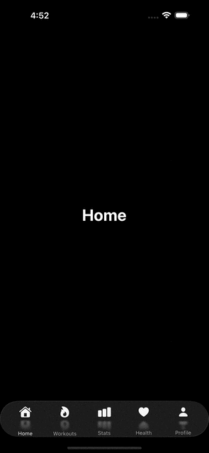
struct TabBarKeyframeDemo: View {

    let tabs: [TabItem] = [
        .init(icon: "house.fill", title: "Home"),
        .init(icon: "flame.fill", title: "Workouts"),
        .init(icon: "chart.bar.fill", title: "Stats"),
        .init(icon: "heart.fill", title: "Health"),
        .init(icon: "person.fill", title: "Profile")
    ]

    @State private var selectedIndex: Int = 0

    var body: some View {
        VStack {
            Spacer()

            Text(tabs[selectedIndex].title)
                .font(.largeTitle.bold())

            Spacer()

            HStack {
                ForEach(Array(tabs.enumerated()), id: \.offset) { index, tab in
                    TabBarItemView(
                        tab: tab,
                        isSelected: selectedIndex == index
                    ) {
                        selectedIndex = index
                    }
                }
            }
            .padding(.horizontal)
            .padding(.top, 10)
            .glassEffect()
        }
    }
}
Build and run