- Jul 11, 2024
Simple Regression comparison on Advertising data
- DevTechie Inc
Problem Statement: Today, we will explore Simple vs Polynomial regression and compare the effectiveness or lack there of based on the nature of the data.
We will download Advertising data from Kaggle and measure TV and Newspaper spend against sales. So lets get going.
# Import all the libraries that we will need
import numpy as np
import pandas as pd
import matplotlib.pyplot as plt
import seaborn as sns
# Load the file using pandas, since we have csv format we are
# using read_csv but other formats are also supportedfile_path = r'/Users/Downloads/advertising.csv'
df_ad_data = pd.read_csv(file_path)
df_ad_data.head()
TV
# Plotting the spend on TV against Total sales using regression line plot
sns.regplot(data=df_ad_data, x='TV', y='Sales')
Figure 1
We see that there is a correlation and is pretty intuitive, since we have one y vector and one X feature, with the help of Seaborn we are able to plot out a regression line using ordinary least squares.
Now we want to calculate this line ourselves. In this article, we will explore only Simple Linear Regression
Simple Linear Regression
Polynomial Regression
Let’s calculate this line first by using simple linear regression as y=mx+c
Simple Linear Fit
#y = B1X + B0
beta_tv_1, beta_tv_0 = np.polyfit(X_TV, y_tv, deg = 1)
Numpy has the function np.polyfit that can calculate the ordinary least squares. Since, we are only calculating a simple equation of y=mx+c our deg will be equal to 1.
Next we generate some potential spend. From above graph we see that TV spend goes upto 300 to we will generate some values under 100 in that range as below
potential_tv_spend = np.linspace(0, 300, 100)Now, per our equation y=mx+c or y=B1X+B0, lets put the values to get y which will be our predicted sales
predicted_tv_sales = beta_tv_1*potential_tv_spend + beta_tv_0It is time to plot the results
sns.scatterplot(data=df_ad_data, x='TV', y='Sales')
plt.plot(potential_tv_spend, predicted_tv_sales, color='red')
Figure 2
So, basically we just have a line that just fit the linear equation of y=mx+c, which is same as what Seaborn regplot was doing for us in Figure 1.
Now lets see if we get the same pattern when we do this for Newspaper
Newspaper
We will do the exact same thing for newspaper, i.e. we will calculate the coefficients using np.polyfit
#First getting our X and y for polyfit
X_Newspaper = df_ad_data['Newspaper']
y_newspaper = df_ad_data['Sales']
beta_np_1, beta_np_0 = np.polyfit(X_Newspaper, y_newspaper, deg = 1)
beta_np_1, beta_np_0Like before, we will generate some random numbers
potential_newspaper_spend = np.linspace(0,100, 100)predicted_newspaper_sales = beta_np_1*potential_newspaper_spend+beta_np_0Lets do the plotting
sns.scatterplot(data=df_ad_data, x='Newspaper', y='Sales')
plt.plot(potential_newspaper_spend, predicted_newspaper_sales, color='red')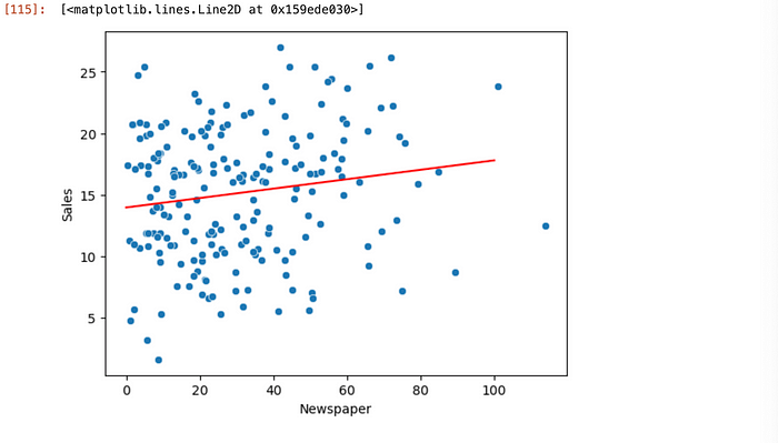
Figure 3
As we can see data is scattered everywhere and if we try to draw a straight line there will be a lot of residual error. This data suggest that for TV, linear regression seems to be a good choice for predicting sales, however, there is no direct correlation for the same with newspaper spend data. We can conclude with graph above that linear regression would not be a good choice to predict sales from newspaper spend.
If we plot using Seaborn regplot , we get a similar line as above.
sns.regplot(data=df_ad_data, x='Newspaper', y='Sales')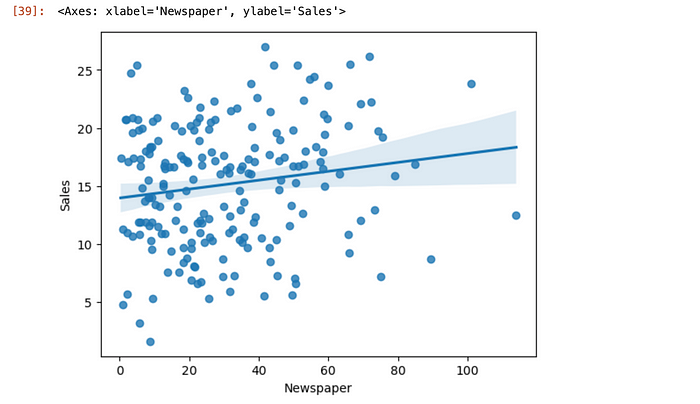
Figure 3
With that we have reached the end of this article. Thank you once again for reading.