- Jul 26, 2025
Mastering VStack in SwiftUI 5 & iOS 17
- DevTechie Inc
- SwiftUI
In SwiftUI, VStack is like a box that holds things one on top of the other, like stacking blocks. It helps put stuff in a neat column on the screen, arranging them from top to bottom. You can put text, pictures, or other things inside this box. It makes it easy to organize your app’s look by piling items in a single vertical line, so everything looks nice and tidy. VStack is like a basic layout tool that helps arrange and organize how things appear on the screen when you’re making apps using SwiftUI.
We will begin with some straightforward examples to better understand VStack. VStack is a type of layout container that automatically aligns items vertically. This makes it simple to control the order, alignment, and spacing of elements within the app’s user interface.
struct ContentView: View {
    var body: some View {
        VStack {
            Text("DevTechie.com")
                .font(.largeTitle)
            Text("Learn iOS Development")
        }
    }
}
In this example, we are setting up a VStack that vertically arranges two Text views.

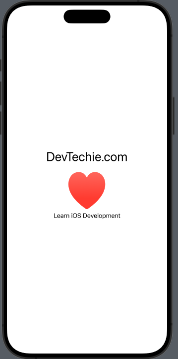
We aren’t restricted to using only Text views; we can also use other types such as Color, Image, or even custom views. Let’s include a red heart SF Symbol image in the VStack.
struct ContentView: View {
    var body: some View {
        VStack {
            Text("DevTechie.com")
                .font(.largeTitle)
            Image(systemName: "heart.fill")
                .resizable()
                .frame(width: 100, height: 100)
                .foregroundStyle(.red.gradient)
            Text("Learn iOS Development")
        }
    }
}
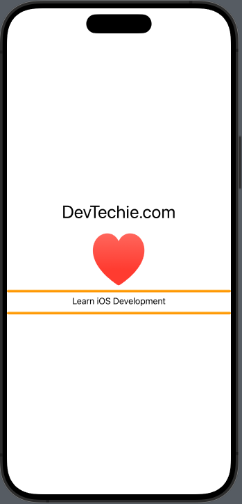
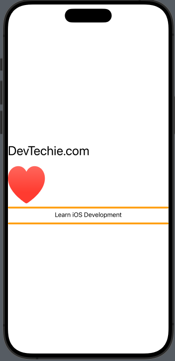
Next, we will try a capsule shape inside the VStack
struct ContentView: View {
    var body: some View {
        VStack {
            Text("DevTechie.com")
                .font(.largeTitle)
            Image(systemName: "heart.fill")
                .resizable()
                .frame(width: 100, height: 100)
                .foregroundStyle(.red.gradient)
            Text("Learn iOS Development")
            Capsule()
                .foregroundStyle(.orange.gradient)
                .frame(height: 20)
        }
    }
}
Let’s restructure the code by taking out the Text view (“Learn iOS Dev”) and Capsule from the ContentView and form a new view called MyCustomView. We’ll also include an extra Capsule view within this new view.
import SwiftUI

struct ContentView: View {
    var body: some View {
        VStack {
            Text("DevTechie.com")
                .font(.largeTitle)
            Image(systemName: "heart.fill")
                .resizable()
                .frame(width: 100, height: 100)
                .foregroundStyle(.red.gradient)

            MyCustomView()
        }
    }
}

struct MyCustomView: View {
    var body: some View {
        VStack {
            Capsule()
                .foregroundStyle(.orange.gradient)
                .frame(height: 5)
            Text("Learn iOS Development")
            Capsule()
                .foregroundStyle(.orange.gradient)
                .frame(height: 5)
        }
    }
}
Before iOS 17 and SwiftUI 5, VStack and other container views had a maximum limit of 10 statically defined child views. This meant they could contain at most 10 child views, and to overcome this limitation, one could nest more VStacks or other container views. Starting from iOS 17, this restriction has been removed, and now we can include as many statically defined items as needed in a VStack or other container views.
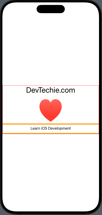
The VStack occupies only the space necessary for arranging its child views, distributing space based on what is available from the parent container. This can be observed by drawing a simple border around the VStack.
struct ContentView: View {
    var body: some View {
        VStack {
            Text("DevTechie.com")
                .font(.largeTitle)
            Image(systemName: "heart.fill")
                .resizable()
                .frame(width: 100, height: 100)
                .foregroundStyle(.red.gradient)
            MyCustomView()
        }
        .border(.red)
    }
}
Up to this point, we’ve used VStack without adding any extra parameters. However, we can pass values for alignment and spacing to VStack if we want to adjust either the alignment of the child views or the space between them. By default, child views are centered in a VStack. We can modify this with the alignment parameter. VStack accepts a HorizontalAlignment parameter to align child views. Additional options include leading, trailing, and center alignment.
struct ContentView: View {
    var body: some View {
        VStack(alignment: .leading) {
            Text("DevTechie.com")
                .font(.largeTitle)
                .border(.red)
            Image(systemName: "heart.fill")
                .resizable()
                .frame(width: 100, height: 100)
                .foregroundStyle(.red.gradient)
                .border(.red)
            MyCustomView()
                .border(.red)
        }
    }
}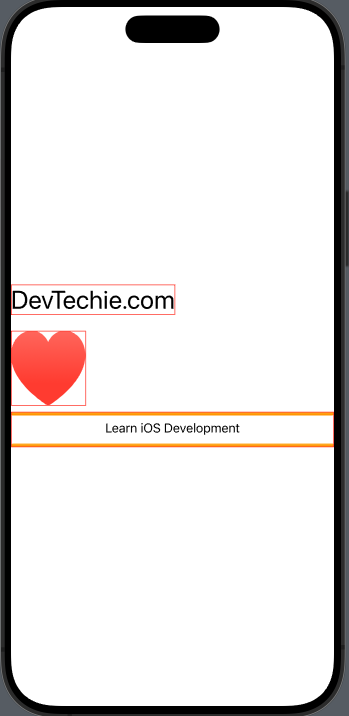
Note that the alignment of the VStack inside MyCustomView didn’t change because it’s still configured with center alignment.
As VStack only occupies the space required for arranging its child views, if all the child views have the same width, the alignment value won’t visibly affect the layout, even if we pass a different alignment value.
struct ContentView: View {
    var body: some View {
        VStack(alignment: .leading) {
            Text("DevTechie.com")
                .font(.largeTitle)
            Text("DevTechie.com")
                .font(.largeTitle)
        }
    }
}
In this example, we’ve specified the alignment as leading, but the VStack child views still appear centered. This occurs because both child views have equal width, and the alignment change isn’t noticeable due to the lack of space for the child views to shift to the leading or trailing edges. If we refer back to the previous example, you’ll observe that the custom view occupies the entire width, making it easier to see the alignment change.
struct ContentView: View {
    var body: some View {
        VStack(alignment: .leading) {
            Text("DevTechie.com")
                .font(.largeTitle)
            Image(systemName: "heart.fill")
                .resizable()
                .frame(width: 100, height: 100)
                .foregroundStyle(.red.gradient)
            MyCustomView()
        }
    }
}
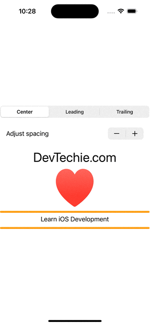
Alignment is inherently animatable. Let’s introduce a State property to monitor the selected alignment index. Using a segmented picker, we can smoothly transition between alignment values. We’ll create an array to store all the supported alignment options.
struct ContentView: View {
    @State private var selectedIndex = 0
    let availableAlignments = [HorizontalAlignment.center, .leading, .trailing]

    var body: some View {
        VStack(alignment: availableAlignments[selectedIndex]) {
            Picker("Select alignment", selection: $selectedIndex) {
                Text("Center")
                    .tag(0)

                Text("Leading")
                    .tag(1)

                Text("Trailing")
                    .tag(2)
            }
            .pickerStyle(.segmented)

            Text("DevTechie.com")
                .font(.largeTitle)
            Image(systemName: "heart.fill")
                .resizable()
                .frame(width: 100, height: 100)
                .foregroundStyle(.red.gradient)
            MyCustomView()

        }
        .animation(.easeInOut, value: selectedIndex)
    }
}
VStack has an additional parameter called spacing, allowing us to modify the space between child views. To demonstrate this, let’s integrate a stepper view in our ContentView, enabling us to adjust the spacing between child views dynamically.
struct ContentView: View {
    @State private var selectedIndex = 0
    let availableAlignments = [HorizontalAlignment.center, .leading, .trailing]

    @State private var spacing: CGFloat = 10

    var body: some View {
        VStack(alignment: availableAlignments[selectedIndex], spacing: spacing) {
            Picker("Select alignment", selection: $selectedIndex) {
                Text("Center")
                    .tag(0)

                Text("Leading")
                    .tag(1)

                Text("Trailing")
                    .tag(2)
            }
            .pickerStyle(.segmented)

            Stepper("Adjust spacing", value: $spacing, step: 2)
                .padding()

            Text("DevTechie.com")
                .font(.largeTitle)
            Image(systemName: "heart.fill")
                .resizable()
                .frame(width: 100, height: 100)
                .foregroundStyle(.red.gradient)
            MyCustomView()

        }
        .animation(.easeInOut, value: selectedIndex)
    }
}
VStack serves as a container view without a distinct visual representation. The majority of modifiers applied to VStack directly impact its child views. Let’s explore this further with examples.
We can alter the width and height of the VStack using the frame modifier.
struct ContentView: View {
    @State private var selectedIndex = 0
    let availableAlignments = [HorizontalAlignment.center, .leading, .trailing]

    @State private var spacing: CGFloat = 10

    var body: some View {
        VStack(alignment: availableAlignments[selectedIndex], spacing: spacing) {
            Picker("Select alignment", selection: $selectedIndex) {
                Text("Center")
                    .tag(0)

                Text("Leading")
                    .tag(1)

                Text("Trailing")
                    .tag(2)
            }
            .pickerStyle(.segmented)

            Stepper("Adjust spacing", value: $spacing, step: 2)
                .padding()

            Text("DevTechie.com")
                .font(.largeTitle)
            Image(systemName: "heart.fill")
                .resizable()
                .frame(width: 100, height: 100)
                .foregroundStyle(.red.gradient)
        }
        .animation(.easeInOut, value: selectedIndex)
        .frame(width: 300, height: 300)
        .border(.orange)
    }
}
It’s important to observe that when specifying the frame for the VStack, the modification is applied to the VStack itself, not its child views.
Conversely, applying the font or foregroundStyle modifier produces a distinct effect on the child views.
struct ContentView: View {
    @State private var selectedIndex = 0
    let availableAlignments = [HorizontalAlignment.center, .leading, .trailing]

    @State private var spacing: CGFloat = 10

    var body: some View {
        VStack(alignment: availableAlignments[selectedIndex], spacing: spacing) {
            Picker("Select alignment", selection: $selectedIndex) {
                Text("Center")
                    .tag(0)

                Text("Leading")
                    .tag(1)

                Text("Trailing")
                    .tag(2)
            }
            .pickerStyle(.segmented)

            Stepper("Adjust spacing", value: $spacing, step: 2)
                .padding()

            Text("DevTechie.com")
                .font(.largeTitle)
            Image(systemName: "heart.fill")
                .resizable()
                .frame(width: 100, height: 100)

        }
        .animation(.easeInOut, value: selectedIndex)
        .frame(width: 300, height: 300)
        .foregroundStyle(.red.gradient)
    }
}
With these examples, we can infer that visual modifiers, when applied to VStack, extend to its child views. In contrast, non-visual modifiers impact the VStack or container views themselves.
With that we have reached the end of this article. Thank you once again for reading. If you liked this, don’t forget to 👏 and follow 😍. Also visit us at https://www.devtechie.com