- Feb 12
Mastering SwiftUI Swipe Actions: Customizing Button Labels with labelStyle
- DevTechie
- SwiftUI
SwiftUI’s swipeActions modifier brings delightful interactivity to your lists and views, allowing users to reveal quick actions with a simple horizontal swipe. By default, these actions typically display both a title and an icon, providing clear context. However, your UI might call for a more compact, icon-only look, or perhaps a title-only approach for highly descriptive actions.
This is where the labelStyle() modifier becomes your best friend. Applied to the swipeActions modifier itself (or even individual Button within it), labelStyle() dictates how the Label views (which are commonly used within swipe action buttons) render their content.
Let’s dive in!
Default Swipe Actions
First, let’s establish a baseline with a standard swipeActions implementation. Notice how we use Label within our Buttons to easily combine text and SF Symbols.
import SwiftUI

struct DefaultSwipeActionsView: View {
    var body: some View {
        NavigationView {
            List {
                ForEach(0..<5) { index in
                    Text("Item \(index + 1): Swipe me for actions")
                        .padding()
                        .swipeActions(edge: .trailing) {
                            Button(role: .destructive) {
                                print("Delete Item \(index + 1)")
                            } label: {
                                Label("Delete", systemImage: "trash.fill")
                            }

                            Button {
                                print("Archive Item \(index + 1)")
                            } label: {
                                Label("Archive", systemImage: "archivebox.fill")
                            }
                            .tint(.blue)
                        }
                }
            }
            .navigationTitle("DevTechie.com")
        }
    }
}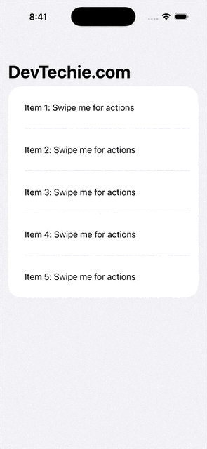
When you swipe an item, you’ll see two buttons: “Delete” with a trash icon, and “Archive” with an archive box icon. This is the default .titleAndIcon style implicitly applied.
1. Title + Icon (Explicitly .titleAndIcon)
While this is often the default behavior, explicitly setting .labelStyle(.titleAndIcon) can be useful for clarity or if you've applied a different default label style elsewhere in your view hierarchy.
import SwiftUI

struct TitleAndIconSwipeActionsView: View {
    var body: some View {
        NavigationView {
            List {
                ForEach(0..<5) { index in
                    Text("Item \(index + 1): Title + Icon")
                        .padding()
                        .swipeActions(edge: .trailing) {
                            Button(role: .destructive) {
                                print("Delete Item \(index + 1)")
                            } label: {
                                Label("Remove", systemImage: "minus.circle.fill")
                            }

                            Button {
                                print("Edit Item \(index + 1)")
                            } label: {
                                Label("Edit", systemImage: "square.and.pencil")
                            }
                            .tint(.orange)
                        }
                        .labelStyle(.titleAndIcon)
                }
            }
            .navigationTitle("DevTechie.com")
        }
    }
}
In this case buttons will display both their text label and their corresponding SF Symbol, providing maximum clarity. This is great for actions that might not be immediately obvious from an icon alone.
2. Icon Only (.iconOnly)
For a more minimalist design, or when your actions are universally recognizable by their icons (like trash, archive, checkmark), .iconOnly is an excellent choice. It saves space and gives your UI a cleaner look.
import SwiftUI

struct IconOnlySwipeActionsView: View {
    var body: some View {
        NavigationView {
            List {
                ForEach(0..<5) { index in
                    Text("Email from John Doe \(index + 1)")
                        .padding()
                        .swipeActions(edge: .trailing) {
                            Button(role: .destructive) {
                                print("Delete Email \(index + 1)")
                            } label: {
                                Label("Delete", systemImage: "trash.fill")
                            }

                            Button {
                                print("Mark as Read Email \(index + 1)")
                            } label: {
                                Label("Read", systemImage: "envelope.open.fill")
                            }
                            .tint(.green)
                        }
                        .labelStyle(.iconOnly)
                }
            }
            .navigationTitle("DevTechie.com")
        }
    }
}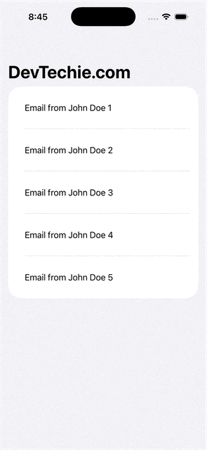
Result: When you swipe, you’ll see only the icons (trash can and open envelope) for the respective actions. The text labels “Delete” and “Read” will be hidden, but still provide accessibility descriptions.
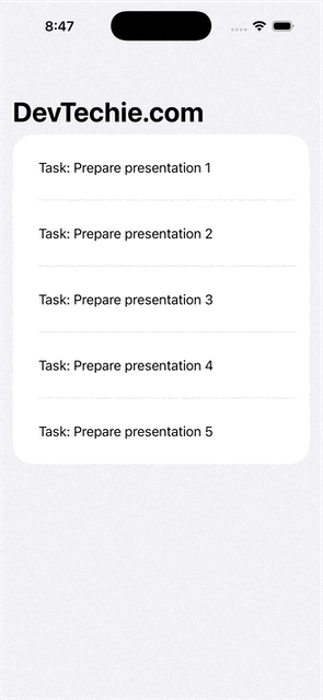
3. Title Only (.titleOnly)
Sometimes, icons can be ambiguous, or you might have very specific actions that are best communicated through text alone. The .titleOnly style is perfect for these scenarios.
import SwiftUI


struct TitleOnlySwipeActionsView: View {
    var body: some View {
        NavigationView {
            List {
                ForEach(0..<5) { index in
                    Text("Task: Prepare presentation \(index + 1)")
                        .padding()
                        .swipeActions(edge: .trailing) {
                            Button(role: .destructive) {
                                print("Cancel Task \(index + 1)")
                            } label: {
                                Label("Cancel", systemImage: "xmark.circle.fill")
                            }

                            Button {
                                print("Complete Task \(index + 1)")
                            } label: {
                                Label("Done", systemImage: "checkmark.circle.fill")
                            }
                            .tint(.purple)
                        }
                        .labelStyle(.titleOnly)
                }
            }
            .navigationTitle("DevTechie.com")
        }
    }
}
Result: Swiping will reveal buttons showing only the text labels “Cancel” and “Done”. The SF Symbols will be hidden. This ensures precise communication for unique or less-iconic actions.
Combining Styles & Important Considerations
You can also apply labelStyle() to individual Buttons within the swipeActions closure if you need to mix and match styles for different actions in the same row. The most specific labelStyle() (i.e., the one applied directly to the Button) will take precedence.
import SwiftUI

struct MixedSwipeActionsView: View {
    var body: some View {
        NavigationView {
            List {
                ForEach(0..<5) { index in
                    Text("Event \(index + 1): Project meeting")
                        .padding()
                        .swipeActions(edge: .trailing) {
                            // titleOnly
                            Button(role: .destructive) {
                                print("Dismiss Event \(index + 1)")
                            } label: {
                                Label("Dismiss", systemImage: "xmark.square.fill")
                            }
                            .labelStyle(.titleOnly)

                            // iconOnly
                            Button {
                                print("Snooze Event \(index + 1)")
                            } label: {
                                Label("Snooze", systemImage: "bell.badge.fill")
                            }
                            .tint(.orange)
                            .labelStyle(.iconOnly)
                        }
                }
            }
            .navigationTitle("DevTechie.com")
        }
    }
}
Master In App Purchase in SwiftUI & iOS 26 with SwiftData
Master In-App Purchases with modern Apple tools. This course teaches you how to design, implement, and manage…www.devtechie.com
Learn more at https://www.devtechie.com