- Feb 11
Mastering NavigationLink Indicator Visibility in SwiftUI (iOS 17+)
- DevTechie
- SwiftUI
SwiftUI, starting with iOS 17, has introduced a highly useful modifier to fine-tune the user interface: navigationLinkIndicatorVisibility. This modifier allows developers to precisely control whether the standard chevron (>) indicator appears on the right side of a NavigationLink. While seemingly a small detail, this control can significantly impact the visual clarity and design consistency of your app.
The NavigationLink is a cornerstone of SwiftUI navigation, providing a simple way for users to tap on an item and navigate to a new view. By default, NavigationLinks often display a chevron indicator on their trailing edge, signaling to the user that tapping will lead to a deeper level of content or a new screen. However, there are many scenarios where this default indicator might be redundant, visually distracting, or simply not fit the intended UI design.
This is where navigationLinkIndicatorVisibility comes into play, offering developers the flexibility to show, hide, or let the system automatically determine the visibility of this indicator.
The navigationLinkIndicatorVisibility modifier is applied directly to a NavigationLink and accepts a value from the Visibility enum:
.automatic: This is the default behavior. The system decides whether to show the indicator based on the context. For most standardNavigationLink, especially within aListorForm, this typically means the indicator will be visible..visible: Explicitly forces the indicator to be shown, regardless of the context..hidden: Explicitly forces the indicator to be hidden, regardless of the context.
Let’s look at an example to understant how to use navigationLinkIndicatorVisibility with a practical SwiftUI example. We'll create a simple list with different NavigationLink demonstrating each visibility option.
First create a simple destination view for our NavigationLinks.
import SwiftUI
struct DestinationView: View {
    let title: String
    var body: some View {
        Text("You've arrived at the \(title) destination!")
            .font(.title2)
            .padding()
            .navigationTitle(title)
            .navigationBarTitleDisplayMode(.inline)
    }
}
Next, we will create NavigationIndicatorExampleView for
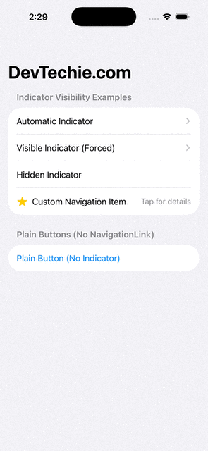
default behavior: without modifier
visible: explicitly setting the visible indicator
hidden: explicitly setting the hidden indicator
custom layout: useful when you design your own trailing content
plain button
struct NavigationIndicatorExampleView: View {
    var body: some View {
        NavigationStack {
            List {
                Section("Indicator Visibility Examples") {
                    // 1
                    NavigationLink("Automatic Indicator") {
                        DestinationView(title: "Automatic")
                    }
                    // 2.
                    NavigationLink("Visible Indicator (Forced)") {
                        DestinationView(title: "Visible")
                    }
                    .navigationLinkIndicatorVisibility(.visible)
                    // 3.
                    NavigationLink("Hidden Indicator") {
                        DestinationView(title: "Hidden")
                    }
                    .navigationLinkIndicatorVisibility(.hidden)
                    // 4.
                    NavigationLink {
                        DestinationView(title: "Custom Item")
                    } label: {
                        HStack {
                            Image(systemName: "star.fill")
                                .foregroundColor(.yellow)
                            Text("Custom Navigation Item")
                            Spacer()
                            Text("Tap for details")
                                .font(.subheadline)
                                .foregroundColor(.gray)
                        }
                    }
                    .navigationLinkIndicatorVisibility(.hidden)
                }
                // 5.
                Section("Plain Buttons (No NavigationLink)") {
                    Button("Plain Button (No Indicator)") {
                        print("This is just a button.")
                    }
                }
            }
            .navigationTitle("DevTechie.com")
        }
    }
}
While powerful, it’s important to use navigationLinkIndicatorVisibilitythoughtfully:
User Experience (UX): Users are accustomed to seeing the chevron as a visual cue for navigation. Hiding it unnecessarily can make your app feel less intuitive or “broken.” Always prioritize clarity.
Accessibility: If you hide the indicator, ensure that the interactive element is still clearly understandable as a navigation control for users relying on VoiceOver or other accessibility features. A clear label and hint (
.accessibilityLabeland.accessibilityHint) can compensate for the lack of a visual indicator.Platform Conventions: Adhere to platform (iOS, macOS, etc.) UI guidelines where appropriate. Overriding standard behaviors should be done with a clear design rationale.
Conclusion
The navigationLinkIndicatorVisibility modifier is a welcome addition to SwiftUI, providing developers with granular control over the appearance of NavigationLinks. By understanding its options and applying it judiciously, you can create more polished, consistent, and user-friendly interfaces that truly reflect your app's unique design language, without sacrificing the underlying navigation functionality. Use it wisely to enhance your app's aesthetics while maintaining clear and accessible navigation.