- Jan 26, 2025
Mastering Labels in SwiftUI
- DevTechie
- SwiftUI
In SwiftUI, a Label is a view that combines a text view with an image view, creating a compact and visually appealing way to present content. It is commonly used to represent buttons, menu items, or any part of the user interface where a text and an image need to appear together.
We can use following initializer to create Label view.
Label("DevTechie", systemImage: "star.fill")
Label view utilizes HStack to position and align the text and image views. The alignment of the HStack is set to .firstTextBaseline, which we can verify by inserting a new line character into the Label view’s text. It’s crucial to understand this so while designing custom styles for labels, we have the option to either match the existing behavior or create a completely different one.
Label("DevTechie \n .com", systemImage: "star.fill")
Labels aren’t limited to using system images (SF Symbols). We can also provide images from the Assets catalog, and there’s an initializer for that. The only limitation is that the image must be small because Label’s initializer that accepts an image as a string input lacks the capability to resize images.
Label("DevTechie.com", image: "bokeh")
Label offers an additional overloaded initializer that accepts a ViewBuilder closure for both the title and image. This provides us with greater control over the Label’s UI.
Label {
      Text("DevTechie.com")
          .font(.largeTitle)
  } icon: {
      Image(systemName: "star.fill")
  }
We don’t have to adhere to the default configurations if we require more control over customizing Label views. The LabelStyle protocol enables us to create custom styles. The protocol’s only requirement is to define the makeBody function.
struct CustomLabelStyle: LabelStyle {
    let iconColor: Color
    let titleColor: Color
    let backgroundColor: Color

    func makeBody(configuration: Configuration) -> some View {
        HStack {
            configuration.icon
                .foregroundStyle(iconColor.gradient)

            configuration.title
                .foregroundStyle(titleColor.gradient)
                .padding(.leading, 10)
                .lineLimit(1)

            configuration.icon
                .foregroundStyle(iconColor.gradient)
        }
        .padding(10)
        .background(
            RoundedRectangle(
                cornerRadius: 10
            ).fill(backgroundColor.opacity(0.2))
        )
    }
}
Label provides additional configuration options with the help of labelStyle modifier
struct ContentView: View {
    var body: some View {
        VStack {
            Label("DevTechie.com", systemImage: "star.fill")
                .labelStyle(.iconOnly)

            Label("DevTechie.com", systemImage: "star.fill")
                .labelStyle(.titleAndIcon)

            Label("DevTechie.com", systemImage: "star.fill")
                .labelStyle(.titleOnly)
        }
    }

}
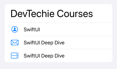
If I had to choose just one reason why you should use Label instead of creating your own image and text inside a HStack, it would be its seamless integration with list views. Labels in list provide consistent alignment hence improving visual appearance.
List without Label:
struct ContentView: View {
    var body: some View {
        List {
            Text("DevTechie Courses")
                .font(.largeTitle)
            HStack {
                Image(systemName: "person.circle")
                Divider()
                Text("SwiftUI 3")
            }
            HStack {
                Image(systemName: "envelope")
                Divider()
                Text("SwiftUI Deep Dive")
            }
            HStack {
                Image(systemName: "calendar.day.timeline.right")
                Divider()
                Text("SwiftUI Deep Dive")
            }
        }
    }

}
Notice the divider; it’s not aligned between rows(it was added to show misalignment). We can fix that by using a Label.
struct ContentView: View {
    var body: some View {
        List {
            Text("DevTechie Courses")
                .font(.largeTitle)

            Label {
                Text("SwiftUI")
            } icon: {
                Image(systemName: "person.circle")
                    .foregroundStyle(.primary)
            }

            Label {
                Text("SwiftUI Deep Dive")
            } icon: {
                Image(systemName: "envelope")
                    .foregroundStyle(.primary)
            }

            Label {
                Text("SwiftUI Deep Dive")
            } icon: {
                Image(systemName: "calendar.day.timeline.right")
                    .foregroundStyle(.primary)
            }
        }
    }

}
Visit us at https://www.devtechie.com for many more iOS learning resources.