- Dec 17, 2024
Implementing a Custom Pop-Up in SwiftUI using ViewModifier
- DevTechie
- SwiftUI
In SwiftUI, a ViewModifier is a protocol that enables us to encapsulate a collection of modifications or behaviors for a view into a reusable component. Instead of repeatedly applying a series of modifiers (such as padding, background, font, and so on) to multiple views, we can create a custom modifier that combines these behaviors and then apply it as a single, reusable modifier.
Benefits of ViewModifier are reusability: Encapsulate repeated view styling or logic into a single modifier. Clean Code: Avoid cluttering our view code with repetitive modifiers. Custom Behavior: Implement complex or conditional view changes.
The ViewModifier protocol requires us to conform to the ViewModifier protocol. Implement the body(content:) method, which takes a view as input and returns a modified version of that view.
Before we build our custom pop-up, let’s understand ViewModifier better with a few examples.
Example 1
First example will focus on creating a custom view modifier for adding padding, a background color, and corner radius.
struct RoundedBackgroundModifier: ViewModifier {
    func body(content: Content) -> some View {
        content
            .padding()
            .background(.orange)
            .cornerRadius(20)
    }
}
Next, we will create an extension to the View protocol for ease of use for this new ViewModifier.
extension View {
    func roundedBackground() -> some View {
        self.modifier(RoundedBackgroundModifier())
    }
}
We are ready to use this modifier inside the SwiftUI view.
struct Example1: View {
    var body: some View {
        VStack {
            Text("Hello, DevTechie!")
                .roundedBackground()
                .foregroundColor(.white)

            Text("Visit www.DevTechie.com")
                .roundedBackground()
                .foregroundColor(.white)
        }
    }
}
We can parameterize the ViewModifier to make it dynamic in nature.
// ViewModifier
struct RoundedBackgroundModifier: ViewModifier {
    var backgroundColor: Color
    var cornerRadius: CGFloat

    func body(content: Content) -> some View {
        content
            .padding()
            .background(backgroundColor)
            .cornerRadius(cornerRadius)
    }
}

// Extension
extension View {
    func roundedBackground(color: Color, radius: CGFloat) -> some View {
        self.modifier(RoundedBackgroundModifier(backgroundColor: color, cornerRadius: radius))
    }
}


struct Example1: View {
    var body: some View {
        VStack {
            Text("Hello, DevTechie!")
                .roundedBackground(color: .indigo, radius: 12)
                .foregroundColor(.white)

            Text("Visit www.DevTechie.com")
                .roundedBackground(color: .mint, radius: 20)
                .foregroundColor(.white)
        }
    }
}
Example 2
Let’s look at another example to add logic to a custom modifier where we conditionally apply styling based on a parameter.
struct ConditionalModifier: ViewModifier {
var isActive: Bool
func body(content: Content) -> some View {
HStack {
content
Image(systemName: "checkmark")
.padding(10)
.background(.red, in: RoundedRectangle(cornerRadius: 5))
.offset(x: isActive ? -15 : -50)
.opacity(isActive ? 1 : 0)
.animation(.easeInOut, value: isActive)
}
}
}
extension View {
func conditionalStyle(isActive: Bool) -> some View {
self.modifier(ConditionalModifier(isActive: isActive))
}
}
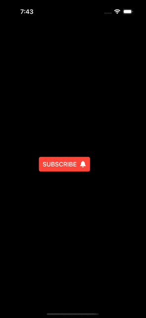
struct Example2: View {
@State private var subscribed = false
var body: some View {
Button {
subscribed.toggle()
} label: {
HStack {
Text("Subscribe")
.textCase(.uppercase)
.bold()
Image(systemName: "bell.fill")
}
.foregroundStyle(.white)
.padding(10)
.background(.red, in: RoundedRectangle(cornerRadius: 5))
}
.conditionalStyle(isActive: subscribed)
}
}
Now when we have knowledge of the basics, we are ready to build that custom dialog we have been talking about.
We will start with a ViewModifier. This ViewModifier will be a generic type taking ModalContent type. ModelContent type will be any type that conforms to the View protocol, so essentially, we can pass in any view into this.
struct PopViewModifier<ModalContent: View>: ViewModifier {
    @Binding var isPresented: Bool
    let modalContent: ModalContent
    @State private var isAnimate = false

    func body(content: Content) -> some View {
        content
            .fullScreenCover(isPresented: $isPresented) {
                if isAnimate {
                    modalContent
                    .transition(.move(edge: .top).combined(with: .scale))

                } else {
                    ZStack { }
                        .presentationBackground(.clear)

                }
            }
            .transaction { transaction in
                if isAnimate == false {
                    transaction.disablesAnimations = true
                }
            }
            .onChange(of: isPresented) { oldValue, newValue in
                DispatchQueue.main.asyncAfter(deadline: .now() + 0.01) {
                    withAnimation(.bouncy) {
                        isAnimate = newValue
                    }
                }
            }

    }
}
Let’s add an extension to the View for convenience.
extension View {
    func popView<ModalContent: View>(isPresented: Binding<Bool>, content: @escaping () -> ModalContent) -> some View {
        self.modifier(PopViewModifier(isPresented: isPresented, modalContent: content()))
    }
}
Next, we will create first dialog view to be passed in as the ModalContent.
struct CustomDialogView: View {
    @Environment(\.dismiss) var dismiss
    var image: Image
    var title: String
    var subtitle: String
    var closeButtonText: String

    var body: some View {
        VStack {
            VStack {
                image
                    .resizable()
                    .aspectRatio(contentMode: .fit)
                    .frame(width: 24, height: 24)
                    .foregroundStyle(.white)
                    .padding(12)
                    .background(.yellow, in: .circle)

               Text(title)
                    .font(.largeTitle)
                    .bold()

                Text(subtitle)
                    .font(.body)
                    .multilineTextAlignment(.center)
            }
            .padding()

            Spacer()

            Button(closeButtonText) {
                dismiss()
            }
            .padding()
        }
        .containerRelativeFrame(.vertical) { height, _ in height / 3}
        .containerRelativeFrame(.horizontal) { width, _ in width / 1.2}
        .background(.thinMaterial, in: .rect(cornerRadius: 20, style: .continuous))
        .presentationBackground(.clear)
    }
}
Let’s use the new modifier and pass the CustomDialogView
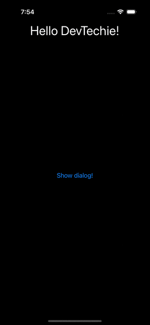
struct CustomPopupDemo: View {
    @State private var isPresented = false

    var body: some View {
        VStack {
            Text("Hello DevTechie!")
                .font(.largeTitle)
            Spacer()
            Button("Show dialog!") {
                withAnimation {
                    isPresented.toggle()
                }
            }

            Spacer()
        }
        .popView(
            isPresented: $isPresented,
            content: {
                CustomDialogView(
                    image: Image(systemName: "heart.fill"),
                    title: "DevTechie.com",
                    subtitle: "Visit https://www.devtechie.com for more content!",
                    closeButtonText: "OK")
            }
        )
    }
Build and run

Let’s create a new view and pass that as the ModalContent.
struct CustomDialogView2: View {
    @Environment(\.dismiss) var dismiss
    var image: Image
    var title: String
    var subtitle: String
    var closeButtonText: String

    var body: some View {
        VStack {
            VStack {
                HStack {
                    image
                        .resizable()
                        .aspectRatio(contentMode: .fit)
                        .frame(width: 24, height: 24)
                        .foregroundStyle(.white)
                        .padding(12)
                        .background(.yellow, in: .circle)

                   Text(title)
                        .font(.largeTitle)
                        .bold()
                }

                Text(subtitle)
                    .font(.body)
                    .multilineTextAlignment(.center)
            }
            .padding()

            Spacer()

            Button(closeButtonText) {
                dismiss()
            }
            .padding()
        }
        .containerRelativeFrame(.vertical) { height, _ in height / 4}
        .containerRelativeFrame(.horizontal) { width, _ in width / 1.2}
        .background(.thinMaterial, in: .rect(cornerRadius: 20, style: .continuous))
        .presentationBackground(.clear)
    }
}
Use this inside the CustomPopupDemo
struct CustomPopupDemo: View {
    @State private var isPresented = false

    var body: some View {
        VStack {
            Text("Hello DevTechie!")
                .font(.largeTitle)
            Spacer()
            Button("Show dialog!") {
                withAnimation {
                    isPresented.toggle()
                }
            }

            Spacer()
        }
        .popView(
            isPresented: $isPresented,
            content: {
                CustomDialogView2(
                    image: Image(systemName: "globe"),
                    title: "DevTechie.com",
                    subtitle: "Visit https://www.devtechie.com for more content!",
                    closeButtonText: "Let's go")}
        )
    }
}
Build and run
With that we have reached the end of this article. Thank you once again for reading. Don’t forget to 👏 and follow 😍. Also subscribe our newsletter at https://www.devtechie.com