- Apr 4, 2025
GeometryReader in SwiftUI: From Basics to Advanced Techniques
- DevTechie
- SwiftUI
GeometryReader is one of the most powerful layout tools available in SwiftUI. Geometry Reader enables us to build responsive designs that adapt to different screen sizes and orientations.
In this article, we will explore GeometryReader from fundamental concepts to advanced applications with practical code examples.
Introduction
GeometryReader is a container view that provides its child views with a geometry proxy, giving them access to their parent’s size and coordinate space. Unlike many SwiftUI views, GeometryReader takes up all available space by default, similar to some other views like Shape and Color views in SwiftUI.
The GeometryProxy object passed to a GeometryReader's content closure contains information about:
size: The size of the containersafeAreaInsets: The safe area insetsframe(in:): A method to get a view's frame in different coordinate spaces like local and global coordinate spaces.
Let’s start with a simple example that shows how to use GeometryReader to access container dimensions.
We will create a GeometryReader with height of 300 points and display the width and height of GeometryReader container.
import SwiftUI

struct GeometryReaderExample: View {
    var body: some View {
        GeometryReader { geometry in
            VStack {
                Text("Width: \(Int(geometry.size.width))")
                    .font(.headline)

                Text("Height: \(Int(geometry.size.height))")
                    .font(.headline)
            }
            .frame(maxWidth: .infinity)
        }
        .frame(height: 300)
        .border(Color.gray)
    }
}

#Preview {
    GeometryReaderExample()
}
Let’s add a Rectangle view within the GeometryReader, with its dimensions set to 80% of the width and height of the GeometryReader container.
struct GeometryReaderExample: View {
    var body: some View {
        GeometryReader { geometry in
            VStack {
                Text("Width: \(Int(geometry.size.width))")
                    .font(.headline)

                Text("Height: \(Int(geometry.size.height))")
                    .font(.headline)

                Rectangle()
                    .foregroundStyle(LinearGradient(colors: [.orange, .pink, .red], startPoint: .topLeading, endPoint: .bottomTrailing))
                    .frame(
                        width: geometry.size.width * 0.8,
                        height: geometry.size.height * 0.8
                    )

            }
            .frame(maxWidth: .infinity)
        }
        .frame(height: 300)
        .border(Color.gray)
    }
}
Notice that we are using relative dimensions to construct this UI, and the view dynamically adapts to the available space and orientation changes.

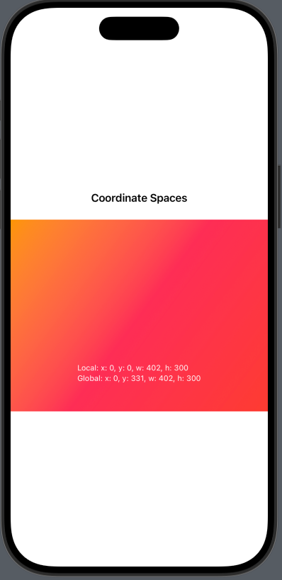
Coordinate Spaces
GeometryReader container provides several coordinate spaces to work with:
.local: Represents the position of a view relative to its immediate parent container. The origin(0,0)is the top-left corner of the view's parent. This is useful when positioning child views inside a container (e.g.,VStack,ZStack,HStack)..global: Represents the absolute position of a view in the entire screen (SwiftUI window coordinate system). The origin(0,0)is the top-left corner of the device screen. This is useful when determining a view’s placement relative to the entire interface..named: A custom coordinate space that you define
struct GeometryReaderExample: View {
    var body: some View {
           VStack {
               Text("Coordinate Spaces")
                   .font(.headline)
                   .padding()

               ZStack {
                   Color.gray.opacity(0.2)

                   GeometryReader { geometry in
                       Rectangle()
                           .foregroundStyle(LinearGradient(colors: [.orange, .pink, .red], startPoint: .topLeading, endPoint: .bottomTrailing))
                           .frame(
                            width: geometry.size.width,
                            height: geometry.size.height)

                       VStack(alignment: .leading) {
                           Text("Local: \(geometryString(geometry.frame(in: .local)))")
                           Text("Global: \(geometryString(geometry.frame(in: .global)))")
                       }
                       .position(x: geometry.size.width / 2, y: geometry.size.height * 0.8)
                       .font(.caption)
                       .foregroundStyle(.white)
                   }
               }
               .frame(height: 300)
           }
       }
       private func geometryString(_ frame: CGRect) -> String {
           return "x: \(Int(frame.origin.x)), y: \(Int(frame.origin.y)), w: \(Int(frame.width)), h: \(Int(frame.height))"
       }
}
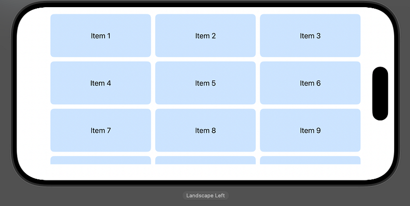
We can use GeometryReader to build truly dynamic views that can adopt to various styles.
Lets build a 3 column flexible grid using GeometryReader
struct GeometryReaderExample: View {
    let items = Array(1...20).map { "Item \($0)" }
        let columns = 3
        let spacing: CGFloat = 10

        var body: some View {
            GeometryReader { geometry in
                ScrollView {
                    let itemWidth = (geometry.size.width - (spacing * CGFloat(columns - 1))) / CGFloat(columns)

                    LazyVGrid(columns: gridItems(width: itemWidth), spacing: spacing) {
                        ForEach(items, id: \.self) { item in
                            Text(item)
                                .frame(height: 100)
                                .frame(maxWidth: .infinity)
                                .background(Color.blue.opacity(0.2))
                                .cornerRadius(8)
                        }
                    }
                }

            }
            .padding()
        }

        private func gridItems(width: CGFloat) -> [GridItem] {
            return Array(repeating: GridItem(.fixed(width), spacing: spacing), count: columns)
        }
}
In the next example, we’ll create a card with a proportional element based on the available space.
struct GeometryReaderExample: View {

    var body: some View {
        GeometryReader { geometry in
            VStack(spacing: 0) {
                // Image takes 60% of the card height
                Image(.photo1)
                    .resizable()
                    .scaledToFill()
                    .frame(height: geometry.size.height * 0.6)
                    .clipped()

                // Content takes remaining 40%
                VStack(alignment: .leading) {
                    Text("Card Title")
                        .font(.headline)

                    Text("This is a card with proportional sizing based on
the available space. The image takes 60% of the height,
while this content area takes the remaining 40%.")
                        .font(.subheadline)
                        .foregroundStyle(.orange.shadow(.drop(radius: 2)))

                    Spacer()

                    HStack {
                        Spacer()

                        Text("Learn more")
                            .font(.caption)
                            .foregroundStyle(.blue.gradient)
                            .padding(.vertical, 8)
                            .padding(.horizontal, 12)
                            .background(Color.blue.opacity(0.1))
                            .clipShape(.rect(cornerRadius: 4))
                    }
                }
                .padding()
                .frame(height: geometry.size.height * 0.4)
            }
            .background(Color.white)
            .clipShape(.rect(cornerRadius: 20))
            .shadow(radius: 5)
        }
        .frame(height: 500)
        .padding()
    }
}
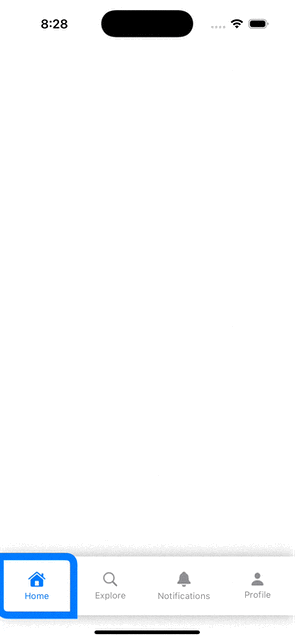
Let’s look at another example and build a custom tab bar using GeometryReader.
import SwiftUI

struct GeometryReaderExample: View {

        let tabs = ["Home", "Explore", "Notifications", "Profile"]
        @State private var selectedTab = 0

        var body: some View {
            VStack {
                Spacer()

                GeometryReader { geometry in
                    let tabWidth = geometry.size.width / CGFloat(tabs.count)

                    ZStack(alignment: .leading) {
                        Rectangle()
                            .fill(Color.white)
                            .frame(height: 80)
                            .shadow(radius: 10)

                        UnevenRoundedRectangle(bottomLeadingRadius: 10, topTrailingRadius: 10)
                            .stroke(Color.blue, lineWidth: 10)
                            .frame(width: tabWidth, height: 80)
                            .offset(x: CGFloat(selectedTab) * tabWidth, y: 0)
                            .animation(.spring(), value: selectedTab)

                        HStack(spacing: 0) {
                            ForEach(0..<tabs.count, id: \.self) { index in
                                Button(action: {
                                    selectedTab = index
                                }) {
                                    VStack(spacing: 4) {
                                        Image(systemName: tabIcon(for: index))
                                            .font(.system(size: 20))

                                        Text(tabs[index])
                                            .font(.caption)
                                    }
                                    .foregroundColor(selectedTab == index ? .blue : .gray)
                                    .frame(width: tabWidth, height: 60)
                                }
                            }
                        }
                    }
                }
                .frame(height: 80)
            }
        }

        private func tabIcon(for index: Int) -> String {
            switch index {
            case 0: return "house.fill"
            case 1: return "magnifyingglass"
            case 2: return "bell.fill"
            case 3: return "person.fill"
            default: return "circle.fill"
            }
        }
}
Let’s update indicator to another style.
struct GeometryReaderExample: View {

    let tabs = ["Home", "Explore", "Notifications", "Profile"]
    @State private var selectedTab = 0

    var body: some View {
        VStack {
            Spacer()

            GeometryReader { geometry in
                let tabWidth = geometry.size.width / CGFloat(tabs.count)

                ZStack(alignment: .leading) {
                    Rectangle()
                        .fill(Color.white)
                        .frame(height: 80)
                        .shadow(radius: 10)

                    // Selected tab indicator
                    UnevenRoundedRectangle(topLeadingRadius: 10, bottomTrailingRadius: 10)
                        .fill(Color.blue)
                        .frame(width: tabWidth, height: 10)
                        .offset(x: CGFloat(selectedTab) * tabWidth, y: -40)
                        .animation(.spring(), value: selectedTab)

                    UnevenRoundedRectangle(bottomLeadingRadius: 10, topTrailingRadius: 10)
                        .fill(Color.blue)
                        .frame(width: tabWidth, height: 10)
                        .offset(x: CGFloat(selectedTab) * tabWidth, y: 40)
                        .animation(.spring(), value: selectedTab)

                    HStack(spacing: 0) {
                        ForEach(0..<tabs.count, id: \.self) { index in
                            Button(action: {
                                selectedTab = index
                            }) {
                                VStack(spacing: 4) {
                                    Image(systemName: tabIcon(for: index))
                                        .font(.system(size: 20))

                                    Text(tabs[index])
                                        .font(.caption)
                                }
                                .foregroundColor(selectedTab == index ? .blue : .gray)
                                .frame(width: tabWidth, height: 60)
                            }
                        }
                    }
                }
            }
            .frame(height: 80)
        }
    }

    private func tabIcon(for index: Int) -> String {
        switch index {
        case 0: return "house.fill"
        case 1: return "magnifyingglass"
        case 2: return "bell.fill"
        case 3: return "person.fill"
        default: return "circle.fill"
        }
    }
}
GeometryReader is a powerful tool in SwiftUI, it offers enhanced control over layout. It facilitates responsive designs that adapt to various device sizes and orientations. However, we should keep UI performance in mind while using this. For instance, GeometryReader triggers a complete layout refresh whenever its parent view updates. Since it relies on layout changes, it can cause unnecessary re-rendering, even when the view’s size remains unchanged. This can negatively affect smooth animations and overall UI responsiveness. Therefore, it’s advisable to use GeometryReader only when absolutely necessary and avoid nesting multiple GeometryReader instances.
Let’s look at the last example where we will utilize GeometryReader with PreferenceKey to propagate a size change to the top-level view.
We will use PreferenceKey to measure the size of a view where a custom modifier is applied and display the size of that view in another view that is outside the view’s hierarchy.
import SwiftUI

struct SizePreferenceKey: PreferenceKey {
    static var defaultValue: CGSize = .zero

    static func reduce(value: inout CGSize, nextValue: () -> CGSize) {
        value = nextValue()
    }
}

struct MeasuringSizeModifier: ViewModifier {
    func body(content: Content) -> some View {
        content
            .background(
                GeometryReader { geometry in
                    Color.clear
                        .preference(
                            key: SizePreferenceKey.self,
                            value: geometry.size
                        )
                }
            )
    }
}

extension View {
    func measureSize(perform action: @escaping (CGSize) -> Void) -> some View {
        self.modifier(MeasuringSizeModifier())
            .onPreferenceChange(SizePreferenceKey.self, perform: action)
    }
}

struct GeometryReaderExample: View {
    @State private var viewSize: CGSize = CGSize(width: 200, height: 50)
    @State private var lastSize: CGSize = CGSize(width: 200, height: 50)

    var body: some View {
        VStack {
            ZStack(alignment: .bottomTrailing) {
                Text("This view knows its own size")
                    .frame(width: viewSize.width, height: viewSize.height)
                    .background(Color.yellow)
                    .clipShape(.rect(cornerRadius: 10))
                    .measureSize { size in
                        viewSize = size
                    }
                    .overlay(alignment: .bottomTrailing) {
                        Image(systemName: "square.resize")
                            .resizable()
                            .rotationEffect(.degrees(90))
                            .foregroundStyle(Color.yellow)
                            .frame(width: 20, height: 20)
                            .background(Color.white.gradient)
                            .offset(x: 5, y: 5)
                            .gesture(
                                DragGesture()
                                    .onChanged { gesture in
                                        let newWidth = max(100, lastSize.width + gesture.translation.width)
                                        let newHeight = max(40, lastSize.height + gesture.translation.height)
                                        viewSize = CGSize(width: newWidth, height: newHeight)
                                    }
                                    .onEnded { _ in
                                        lastSize = viewSize
                                    }
                            )
                    }
            }
            // Display size
            Text("Width: \(Int(viewSize.width)), Height: \(Int(viewSize.height))")
                .padding()
        }
    }
}


#Preview {
    GeometryReaderExample()
}
When used correctly, GeometryReader helps create unique UI effects, custom layouts, and interactive elements that would otherwise be difficult to implement. By following the best practices, we can harness GeometryReader’s capabilities while maintaining a performant and maintainable codebase.
Visit us at: https://www.devtechie.com for detailed iOS learning resources.