- Sep 5, 2025
Ditch the Boring Picker: Let's Build a Segmented Control People Actually Want to Tap!
- DevTechie
- SwiftUI
Let’s be honest, the default SwiftUI Picker with the .segmented style is... fine. It's functional. It does the job. But does it have personality? Does it match your app's unique brand? Probably not.
What if you could create a segmented control that slides, bounces, and feels incredibly satisfying to use? A control that can be anything from a sleek underline to a chunky, icon-filled tab bar.
In this guide, we’re going to do just that. We’ll start by building a classic “sliding pill” style control, and then I’ll show you how to unleash your creativity with different styles. The secret weapon? A magical SwiftUI tool called matchedGeometryEffect.
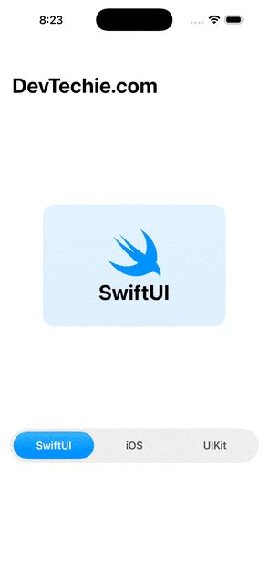
Here’s a sneak peek at what we’ll build:
Ready? Let’s dive in!
Step 1: The Blueprint (Our Data Model)
First things first, we need to define the “segments” for our control. The cleanest and safest way to do this in Swift is with an enum. Think of it as the menu for our control. Each case in the enum will be one of our buttons.
We’ll conform it to CaseIterable so we can easily loop through all the options.
import SwiftUI

// Our menu of options!
enum AppTab: String, CaseIterable {
    case swiftUI = "SwiftUI"
    case iOS = "iOS"
    case uIKit = "UIKit"

    // Let's give each tab a unique color for fun
    var color: Color {
        switch self {
        case .iOS:
            return .pink
        case .swiftUI:
            return .blue
        case .uIKit:
            return .purple
        }
    }

    // And an icon, because why not?
    var icon: String {
        switch self {
        case .iOS:
            return "apple.logo"
        case .swiftUI:
            return "swift"
        case .uIKit:
            return "macwindow"
        }
    }
}
By adding properties like color and icon directly to our enum, we keep all the configuration neat and tidy in one place.
Step 2: The Main Event — Building the “Sliding Pill”
Now for the fun part. We’re going to build the UI. The core idea is simple:
Lay out all our options horizontally in an
HStack.Draw a colorful capsule behind the currently selected option.
Use the magic of
matchedGeometryEffectto make that capsule slide smoothly when the selection changes.
Let’s set up our SegmentedControlSwiftUI.
struct SegmentedControlSwiftUI: View {
    @State private var selectedTab: AppTab = .swiftUI
    @Namespace private var animation

    var body: some View {
        NavigationStack {
            VStack {
                Spacer()
                // A fun display area that changes with the selection
                VStack {
                    Image(systemName: selectedTab.icon)
                        .font(.system(size: 80))
                        .foregroundColor(selectedTab.color)
                    Text(selectedTab.rawValue)
                        .font(.largeTitle.bold())
                }
                .padding(60)
                .frame(width: 300, height: 200)
                .background(selectedTab.color.opacity(0.15).gradient, in: RoundedRectangle(cornerRadius: 20))

                Spacer()

                // Here is our custom segmented control!
                customSegmentedControl

                Spacer()
            }
            .navigationTitle("DevTechie.com")
        }
    }

    // We'll put the control in its own computed property for clarity
    var customSegmentedControl: some View {
        HStack(spacing: 0) {
            ForEach(AppTab.allCases, id: \.rawValue) { tab in
                Text(tab.rawValue)
                    .font(.headline)
                    .padding(.vertical, 12)
                    .frame(maxWidth: .infinity)
                    .foregroundStyle(selectedTab == tab ? .white : .primary.opacity(0.7))
                    .background {
                        // The magic happens here!
                        if selectedTab == tab {
                            Capsule()
                                .foregroundStyle(selectedTab.color.gradient)
                                .matchedGeometryEffect(id: "selected_tab", in: animation)
                        }
                    }
                    .contentShape(.rect) // Makes the whole area tappable
                    .onTapGesture {
                        // Update the state with a bouncy animation
                        withAnimation(.bouncy) {
                            selectedTab = tab
                        }
                    }
            }
        }
        .padding(6)
        .background(.primary.opacity(0.08), in: .capsule)
        .padding(.horizontal)
    }
}
Breakdown of the Magic:
@Namespace private var animation: Think of this as a group chat for your views. Any views in this namespace with the same ID can animate their geometry (size and position) between each other..matchedGeometryEffect(id: "selected_tab", in: animation): This is the secret sauce. We give our slidingCapsulea unique ID, "selected_tab". WhenselectedTabchanges, SwiftUI sees that a new view (the capsule under the new tab) now has this ID. It automatically calculates the difference in position and size and creates a seamless animation from the old location to the new one.withAnimation(.bouncy): By wrapping our state change (selectedTab = tab) in this block, we tell SwiftUI to use a fun, springy animation for the transition. It feels so much more alive than a simple fade!
Go ahead, build and run! You now have a gorgeous, animated segmented control. But don’t stop here…
🎨 Let’s Get Creative! More Fun Examples
The best part about building your own components is the freedom to create anything you want. The matchedGeometryEffect technique is incredibly versatile.
Example 1: The Sleek Underline Style
This is a very popular, modern style you see in many apps. Instead of a pill background, we just animate an underline.
To achieve this, we only need to make a small change to our background modifier.
.background {
    ZStack(alignment: .bottom) { // Use a ZStack to place the underline
           if selectedTab == tab {
               Rectangle()
                   .frame(height: 3)
                   .offset(y: 12)
                   .foregroundStyle(selectedTab.color)
                   .matchedGeometryEffect(id: "underline", in: animation) // Use a new ID
           }
       }
}
Just by swapping a Capsule for a thin Rectangle and changing the animation type, we have a completely different feel!
Example 2: The Icon & Text Toggle
What if you want both an icon and text? Easy! We already added the icon name to our enum. Let's use it.
// Replace the Text(tab.rawValue) inside the ForEach with an HStack
HStack(spacing: 8) {
    Image(systemName: tab.icon)
    Text(tab.rawValue)
}
It’s that simple. Because our view is composable, we can drop an HStack in there and it just works.
🚀 The Pro Move: Making It Reusable
Hardcoding the segmented control inside ContentView is great for learning, but in a real app, you'll want to reuse it everywhere. Let's extract it into its own View.
This makes our code cleaner and lets us create controls for any enum we want!
struct ReusableSegmentedControl<T: Hashable & CaseIterable & RawRepresentable>: View where T.RawValue == String {

    // The selection is now a @Binding so it can be changed from the parent view
    @Binding var selection: T
    private let items: [T] = T.allCases as! [T]
    @Namespace private var animation

    // We add a function to get the color for a specific item
    let colorProvider: (T) -> Color

    var body: some View {
        HStack(spacing: 0) {
            ForEach(items, id: \.self) { item in
                Text(item.rawValue)
                    .font(.headline)
                    .padding(.vertical, 12)
                    .frame(maxWidth: .infinity)
                    .foregroundStyle(selection == item ? .white : .primary.opacity(0.7))
                    .background {
                        if selection == item {
                            Capsule()
                                .foregroundStyle(colorProvider(item).gradient)
                                .matchedGeometryEffect(id: "reusable_tab", in: animation)
                        }
                    }
                    .contentShape(.rect)
                    .onTapGesture {
                        withAnimation(.bouncy) {
                            selection = item
                        }
                    }
            }
        }
        .padding(6)
        .background(.primary.opacity(0.08), in: .capsule)
        .padding(.horizontal)
    }
}
SegmentedControlView
struct SegmentedControlSwiftUI: View {
    @State private var selectedTab: AppTab = .swiftUI
    @Namespace private var animation

    var body: some View {
        NavigationStack {
            VStack {
                Spacer()
                // A fun display area that changes with the selection
                VStack {
                    Image(systemName: selectedTab.icon)
                        .font(.system(size: 80))
                        .foregroundColor(selectedTab.color)
                    Text(selectedTab.rawValue)
                        .font(.largeTitle.bold())
                }
                .padding(60)
                .frame(width: 300, height: 200)
                .background(selectedTab.color.opacity(0.15).gradient, in: RoundedRectangle(cornerRadius: 20))

                Spacer()

                // Here is our custom segmented control!
                ReusableSegmentedControl(selection: $selectedTab, colorProvider: { $0.color })

                Spacer()
            }
            .navigationTitle("DevTechie.com")
        }
    }

}
Wrapping Up
You did it! You’ve gone from the boring default Picker to building a stunning, animated, and fully reusable segmented control.
The key takeaway is the power of matchedGeometryEffect. It's your secret weapon for creating fluid, dynamic interfaces that feel polished and professional. Now that you have the blueprint, experiment with it! Try different shapes, animations, and layouts. The possibilities are endless. Happy coding!