- Feb 14
Badges with List, ToolbarItems, TabView in SwiftUI
- DevTechie
- SwiftUI
SwiftUI makes adding small, informative badges to your UI elements incredibly straightforward. Badges are perfect for indicating unread messages, new items, pending actions, or status updates without taking up significant screen real estate.
This article will guide you through using the .badge() modifier in SwiftUI, demonstrating its application in List rows, ToolbarItem, TabView items, and other common scenarios with practical code examples.
Badge in a List Row
Badges are commonly used in lists to show unread counts for items like emails, notifications, or messages.
import SwiftUI

struct ListBadgeExample: View {
    var body: some View {
        NavigationView {
            List {
                Text("Inbox")
                    .badge(5) // Displays "5" badge

                Text("Favorites")
                    .badge("New!") // Displays "New!" badge
                    .badgeProminence(.standard)// The prominence to apply to badges.

                HStack {
                    Image(systemName: "photo.fill")
                    Text("Photos")
                }
                .badge(23) // Badge on an HStack within the List
                .badgeProminence(.increased)

                Text("Settings") // No badge

                // Example with a dynamic badge count
                Section("Friends") {
                    FriendRow(name: "Alice", unreadCount: 2)
                    FriendRow(name: "Bob", unreadCount: 0)
                    FriendRow(name: "Charlie", unreadCount: 7)
                }
            }
            .navigationTitle("DevTechie's Mailbox")
        }
    }
}

struct FriendRow: View {
    let name: String
    let unreadCount: Int

    var body: some View {
        HStack {
            Text(name)
            Spacer()
            if unreadCount > 0 {
                // Apply badge conditionally
                Text("Messages")
                    .badge(unreadCount)
                    .badgeProminence(.decreased)
            } else {
                Text("Messages")
            }
        }
    }
}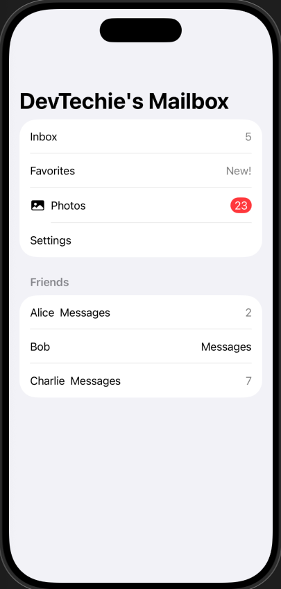
In this code, the .badge() modifier is applied directly to the view within the List row. SwiftUI automatically positions it, typically at the trailing edge of the row content, right-aligned.
Badge in a ToolbarItem
Toolbar items often benefit from badges to highlight new notifications or pending actions without cluttering the main content area.
struct ToolbarBadgeExample: View {
    @State private var notificationsCount: Int = 3

    var body: some View {
        NavigationStack {
            VStack {
                Text("Dashboard Content")
                    .font(.title)
                    .padding()

                Button("Clear Notifications") {
                    notificationsCount = 0
                }
                .buttonStyle(.borderedProminent)
            }
            .navigationTitle("DevTechie's Home Page")
            .toolbar {
                ToolbarItem(placement: .topBarTrailing) {
                    Button {
                        // Action for notification button
                        print("Notifications tapped!")
                        notificationsCount = 0 // Clear badge on tap
                    } label: {
                        Label("Notifications", systemImage: "bell.fill")
                    }
                    .badge(notificationsCount) // Apply badge to the Button
                }

                ToolbarItem(placement: .topBarLeading) {
                    Button {
                        print("Profile tapped!")
                    } label: {
                        Label("Profile", systemImage: "person.circle.fill")
                    }
                    .badge("VIP") // Example of a string badge on another toolbar item
                }
            }
        }
    }
}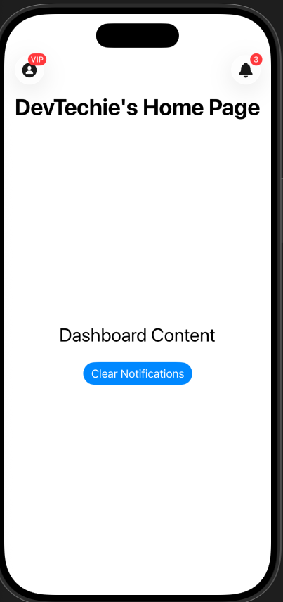
In this code, the .badge() modifier is applied directly to the Button (or Label) inside the ToolbarItem. SwiftUI renders the badge over the associated icon. We use a @State variable to dynamically update the badge count, demonstrating how you might clear notifications.
Badge in a TabView Item
Tab bars are a primary navigation component, and badges are crucial here to inform users about new activity in a specific tab.
struct TabViewBadgeExample: View {
    @State private var unreadMessages: Int = 7
    @State private var newFeatures: Bool = true

    var body: some View {
        TabView {
            // Tab 1: Home
            NavigationView {
                VStack {
                    Text("Welcome DevTechie!")
                        .font(.title)
                    Button("Mark features as read") {
                        newFeatures = false
                    }
                    .buttonStyle(.bordered)
                }
                .navigationTitle("Home")
            }
            .tabItem {
                Label("Home", systemImage: "house.fill")
            }
            .badge(newFeatures ? "New!" : nil) // Conditional string badge

            // Tab 2: Inbox
            NavigationView {
                VStack {
                    Text("You have \(unreadMessages) unread messages.")
                        .font(.title2)
                    Button("Clear Inbox") {
                        unreadMessages = 0
                    }
                    .buttonStyle(.borderedProminent)
                }
                .navigationTitle("Inbox")
            }
            .tabItem {
                Label("Inbox", systemImage: "envelope.fill")
            }
            .badge(unreadMessages > 0 ? unreadMessages : 0) // Conditional integer badge

            // Tab 3: Profile (no badge)
            NavigationView {
                Text("Your Profile")
                    .font(.title)
                    .navigationTitle("Profile")
            }
            .tabItem {
                Label("Profile", systemImage: "person.fill")
            }
        }
    }
}
Best Practices for Using Badges
Keep it Concise: Badges are for quick information. Use numbers for counts and very short, impactful words for status (e.g., “New”, “Pro”, “!”).
Use Sparingly: Overuse of badges can lead to visual clutter and diminish their effectiveness. Reserve them for truly important updates or unread indicators.
Ensure Accessibility: SwiftUI badges are generally accessible. Screen readers will typically announce the badge content along with the associated view.
Update Dynamically: Badges are most useful when they reflect real-time data. Use
@Stateor@Observableobjects to update badge counts or text as your app's data changes.Clear When Read: Once a user has interacted with the content a badge represents, clear the badge to avoid notification fatigue.
Conclusion
SwiftUI’s .badge() modifier is a powerful yet simple tool for enhancing user experience by providing clear, concise notifications. Whether you're displaying unread counts in a List, highlighting new features in a TabView, or drawing attention to a ToolbarItem, the .badge() modifier makes it incredibly easy to integrate these visual cues while maintaining a consistent platform aesthetic. Embrace its simplicity to make your apps more intuitive and engaging!
Mastering Machine Learning in iOS with SwiftUI: From Basics to Advanced
This hands-on guide covers Create ML, Core ML, Vision, helping you build AI-powered apps effortlessly. Learn to train…www.devtechie.com
Learn more at https://www.devtechie.com